NeonChamp
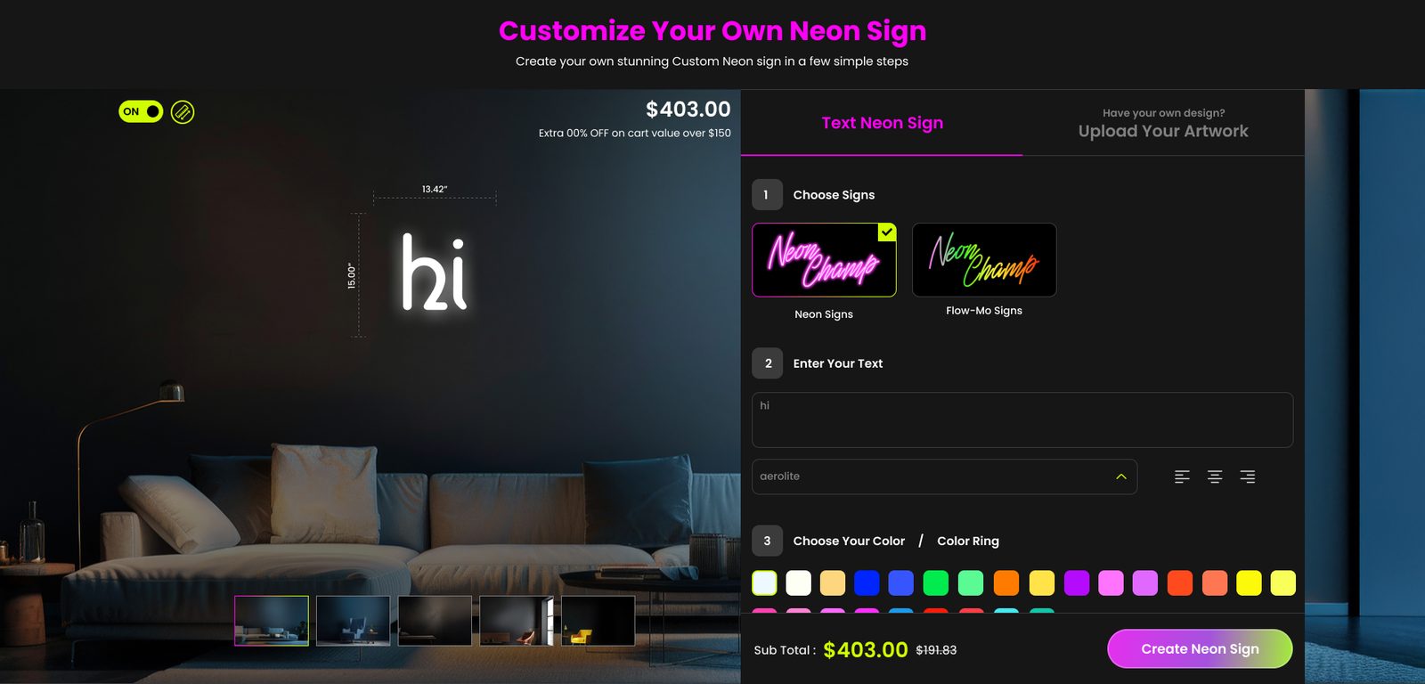
Custom neon shopping and customisation. Helping shoppers understand preview, size, colour, backboard, hardware and price within one clearer purchase journey.
- Role
- UI/UX Technical Leader
- Status
- Shipped
Product & UX Designer Design Leader
I turn complex product journeys into clear,
human-centred experiences.
I bring hands-on eCommerce and product-customization experience, thoughtful
UX decisions, and collaborative design leadership.
Bengaluru

Work
Three projects exploring commerce, customization, and accessible learning.
Custom neon shopping and customisation. Helping shoppers understand preview, size, colour, backboard, hardware and price within one clearer purchase journey.
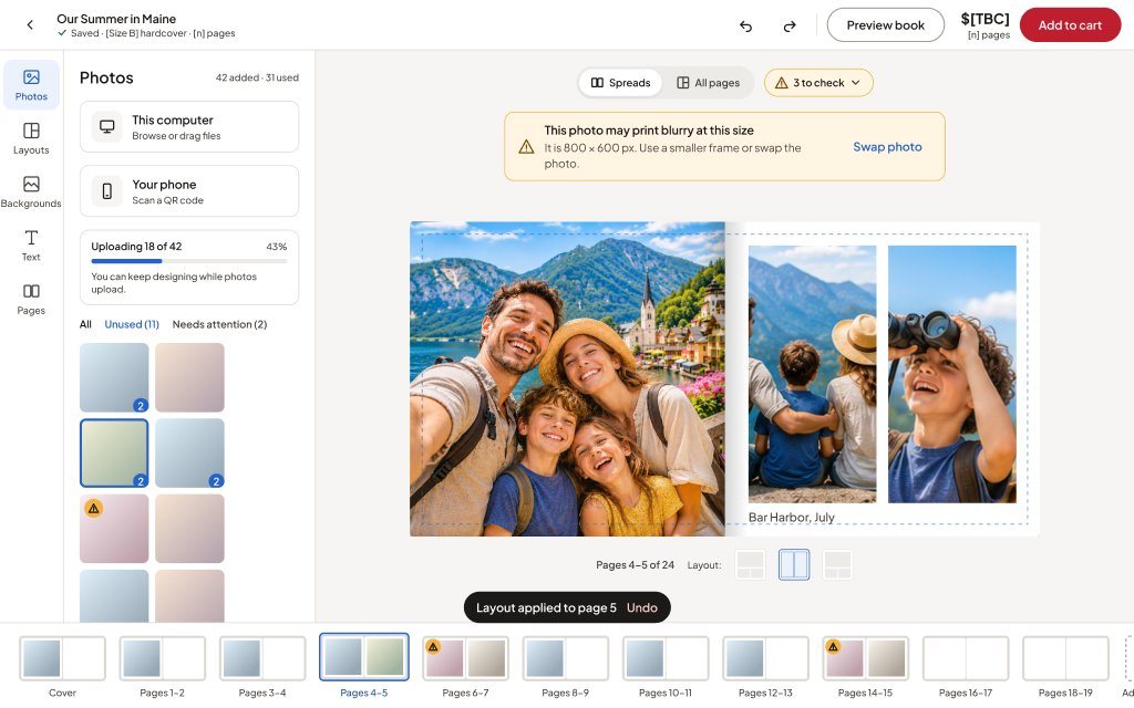
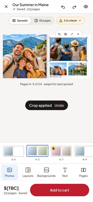
Photo book creation and customisation. Giving shoppers confidence about size, cover, paper, layout and image quality before they pay.
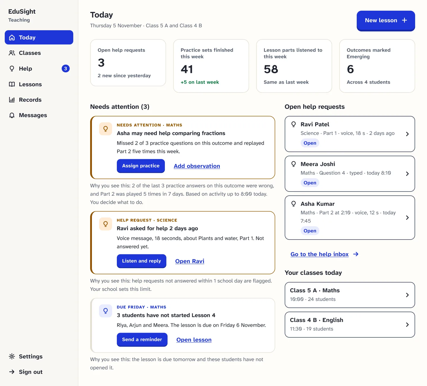
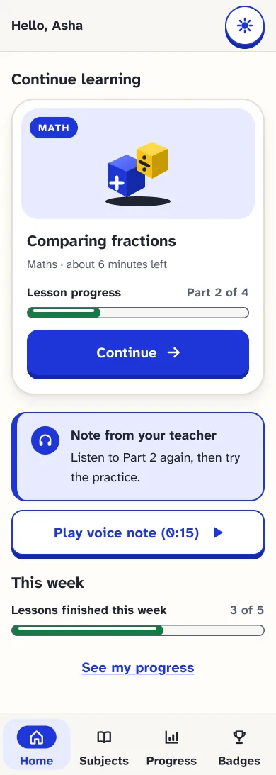
Accessible learning support. Helping teachers record progress, identify skill gaps and guide next steps for visually impaired children.
Also
Smaller projects and experiments alongside the main case studies.


About me
My path started in 2005, when a documentation role introduced me to website design. I taught myself HTML and CSS from software help documentation, and grew from web design into UX and design leadership.
Most of my work sits in eCommerce and product customisation: neon signs, photo books and personalised prints, where shoppers make many connected choices before they pay.
I stay hands-on in the screens while mentoring designers and working with project managers, developers and customer success teams through delivery.
About my journeyA personal introduction — coming soon.
Expertise and leadership
What I'm responsible for on a product team, and where you can see it in the work.
Reviewing hierarchy, states and consistency, preparing developer-ready designs, and checking the built UI against what we agreed.
Where to see it:
Specific feedback in rounds, so designers learn the reasoning and not just the fix. Working with project managers, developers and customer success teams through delivery.
Where to see it:
How I work
Projects differ, so the steps flex. These are the habits I come back to, not a fixed formula every project followed.
Start from the business ask and the people it affects, then restate it as a product problem the team can agree on.
EduSight began with classroom visits and conversations with teachers before any screens were drawn.
Map the steps, decisions and states before designing screens, so the flow makes sense before it looks finished.
On NeonChamp, a staged customiser became one numbered flow beside a live preview and subtotal.
Explore a few directions quickly, then take the chosen one into detailed, responsive design.
NeonChamp started from storyboard sketches. The Photo Book concept became a clickable set of screens with its own design system.
Review options with the people who build, sell and support the product, and check decisions against the evidence available.
EduSight went through two rounds of mentor critique. Usability testing with users is still to come, and the case study says so.
Stay with the work while it is built, so what ships matches what was agreed.
On CanvasChamp I ran UI quality reviews through continuous releases.
Endorsement
Hardik SuranaCustomer Success ManagerCommerce Pundit
Having worked closely with Komal, I saw her bring structure to complex eCommerce requirements, align design decisions with business and development teams, and carry the experience through implementation. She combined strong UX judgment with dependable ownership.
Contact
I'm open to Senior Product Designer and Product Design Lead roles in Bengaluru, where I can shape complex journeys and help a design team grow. Email is the quickest way to reach me.
For a role, a project or a collaboration, email is the quickest way to reach me.
ctckomal@gmail.com
About me
 Self-taught, curious, and still learning. Good design brings clarity, meaning and accessibility to complex problems.
My design journey began in 2005 with a part-time documentation job that brought back a childhood wish to make things. I had no design degree, so I followed my curiosity. I was studying BCA after a commerce background and working on project-bidding documents to support my family. I didn't know Photoshop, Dreamweaver, HTML or CSS.
While helping my first mentor, Nagendra Mishra, improve the colours on website designs, I realised how much I enjoyed shaping what people see and use. I took three days of leave, taught myself HTML and CSS from software help documentation, went to an interview, and was hired as a junior web designer.
Education, family, career breaks and changing technology have all been part of the path. Each one made me more observant, more patient, and better at helping other people do their best work.
Career timeline
From documentation work to leading product design, one step at a time.
2005
Part-time project-bidding documentation while studying. Improving a website's colours for my first mentor showed me what I wanted to do.
Part-time work
While studying BCA
2005
Expertise
Contribution
2006
No formal design education. I learned HTML and CSS from software help documentation, and took three days of leave to do it.
Self-taught
No formal design education
2006
Expertise
Contribution
2007
Hired at IndiaNIC Infotech as a Junior Web Designer, creating websites that went live. Trained in Yahoo Store development and applied those skills to eCommerce projects.
IndiaNIC Infotech
Junior Web Designer
2007
Expertise
Contribution
2010
At Communication Crafts I took client websites and interfaces from first concept through to production.
Communication Crafts
Senior Web Designer
Jun 2010 – Jun 2013
Expertise
Contribution
2013
At MetaTagg Solutions I turned business requirements into responsive websites and visual systems developers could build from.
MetaTagg Solutions
Senior Web Designer
Jun 2013 – Mar 2016
Expertise
Contribution
2017
From February 2017 to August 2026 I led UI/UX on CanvasChamp at Commerce Pundit Technologies as UI/UX Technical Leader, Design Lead and Team Mentor. I mentored a 12-person design team and later directed the NeonChamp customiser redesign.
Commerce Pundit Technologies
UI/UX Technical Leader, Design Lead and Team Mentor
Feb 2017 – Aug 2026
Expertise
Contribution
Today
In 2026 I anchored my team at Design Hackathon 9 with EduSight, built FitBite Desk with AI tools, and I’m getting ready for Hackathon 10. Next: a Product Design Lead role in Bengaluru.
What I’m working on
Hackathons and AI-assisted builds
2026
Design Hackathon 9
EduSight
Anchored the team through field research and the V1 prototype, then designed V2 on my own.
Read the case studyAI experiment
FitBite Desk
A small app that helps office workers plan and pack homemade lunches, designed and built with AI tools.
View case study View live app (opens in a new tab)Design Hackathon 10
Upcoming
My next hackathon project. Details coming soon.
Leadership approach
The goal is a team whose design judgement grows until it needs less correction from me.
Before screens, agree with product what we are solving, for whom, and what we won't change.
Specific feedback in rounds, so designers learn the reasoning, not just the fix.
Like which backboard NeonChamp should recommend, or the final button label. I take them to product with options.
One option card, one way to warn, one way to confirm. Patterns save the team from solving the same problem twice.
Mobile gets its own pattern when the desktop one doesn't fit, rather than a squeezed copy.
Developer handoff, a shared source of truth for state, and a review of the built UI with QA.
Tools and purpose
AI helps me explore more directions and get to a testable draft sooner. I used it to produce the Figma screens for the Photo Book concept under my direction, and to synthesise EduSight field notes, which I kept separate from what teachers actually said.
I decide what goes forward. I check the output against the problem, the brand and accessibility, and I'm accountable for the result.
Beyond design
I make macramé pieces through my small brand, Nest of Macrame. Knotting teaches patience, attention to detail, and how small parts build something strong.
Reading and trying new tools keeps me open to better ways of working, and keeps me asking where AI helps and where human judgement matters most.
A daily practice that helps me stay calm, listen without judgement, and design with care for how people feel.
I create with my hands, learn with curiosity, and design with gratitude.
Résumé
Senior Product & UX Designer and UI/UX Technical Leader, focused on eCommerce and product customisation.I work across responsive design, accessibility and design leadership, from product pages and customisation flows to developer-ready designs and UI quality reviews.
Based in India, looking for roles in Bengaluru. The full résumé is below, or open the PDF version.
UI/UX Technical Leader, Design Lead and Team Mentor · Commerce Pundit Technologies
Led UI/UX on a live personalised-print store: product pages, landing pages and customisation flows across desktop and mobile. Mentored a 12-person design team, prepared developer-ready designs and ran UI quality reviews through continuous releases.
UI/UX Technical Leader · design direction and review
Set the direction that turned a staged customiser into one numbered flow beside a live preview and subtotal. Guided the designer and worked with product, engineering and QA through delivery.
Concept direction and design decisions
A clickable 24-screen concept and design system for the Photo Book journey, prepared for the client to consider. Not launched or tested.
Team anchor (V1 hackathon), sole designer (V2)
Field research with blind teachers, a hackathon prototype, then a V2 product design with a design system, 64 prototype screens and accessibility specifications. Not yet built or usability-tested.
Senior Web Designer
Translated business requirements into responsive websites and implementation-ready visual systems.
Senior Web Designer
Delivered client website and interface design from concept through production.
Junior Web Designer
Created websites that went live. Trained in Yahoo Store development and applied those skills to eCommerce projects. Before this, I taught myself HTML and CSS in 2006.
Design collection · eCommerce
Eighteen storefronts, each with its original homepage preserved and a complete shopping journey designed to match: product listing, product detail, cart, checkout and order success. Desktop 1920 and mobile 390, connected as clickable Figma prototypes.
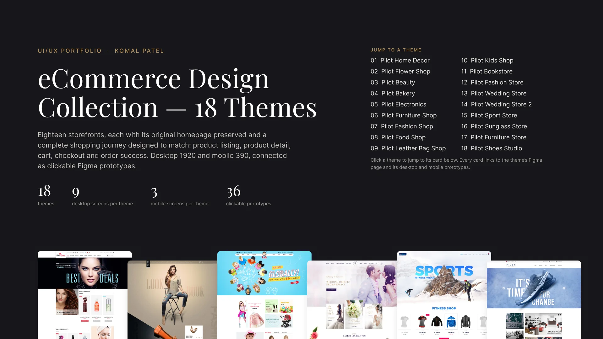
The homepages set each brand's look. My job was to carry that look through every step a shopper takes, so a buyer never feels they've left the store.
Every theme keeps its original homepage. Type, colour, imagery and buttons on the new pages follow it.
Product listing, product detail, cart, checkout and order success, for desktop at 1920 and mobile at 390.
Each theme has a desktop and a mobile prototype, 36 in all, so the flow can be walked through end to end.
Shown here with Theme 03, Pilot Beauty. Every theme follows the same path.
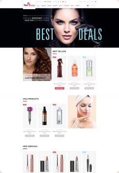
Homepage
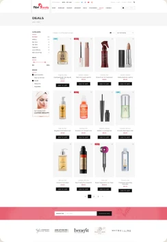
Product listing
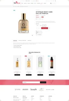
Product detail
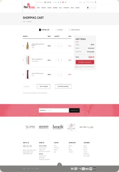
Cart
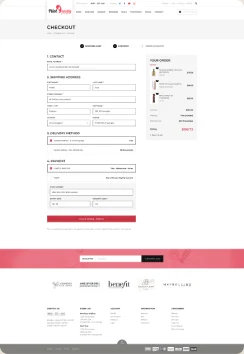
Checkout
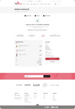
Order success
Desktop and mobile homepage for each storefront.
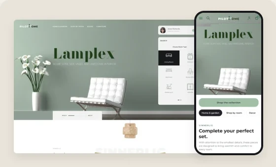
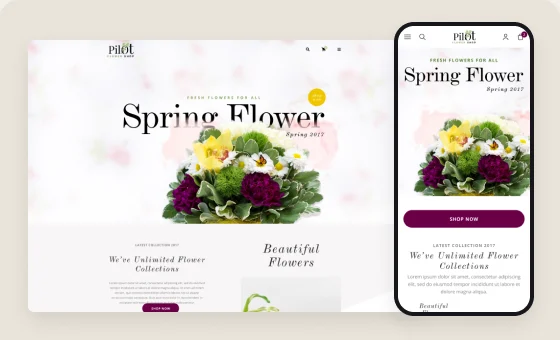
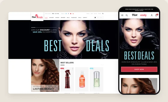
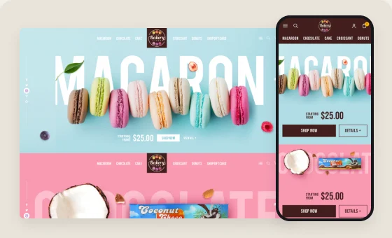
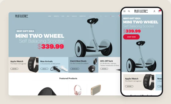
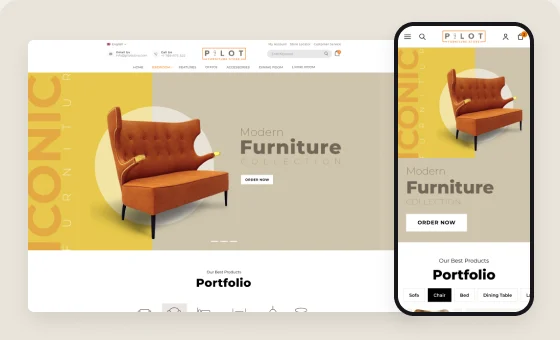
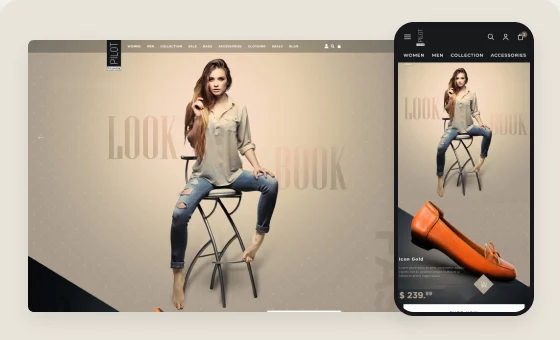
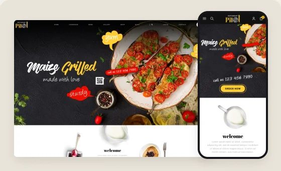
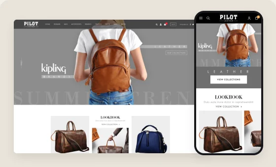
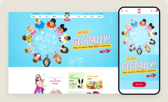
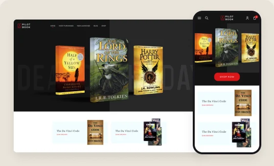
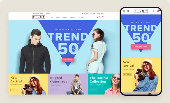
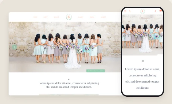
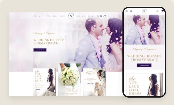
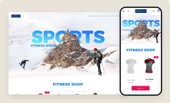
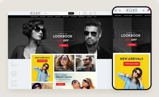
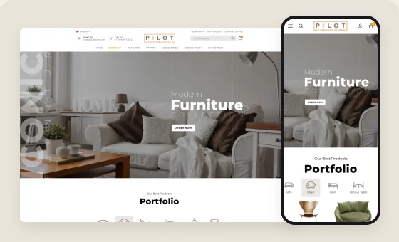
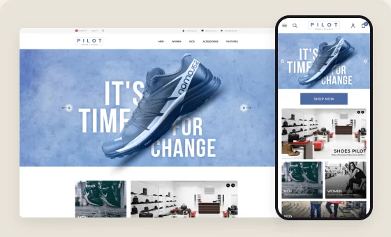
The Figma file links every theme to its desktop and mobile prototype.
Independent product experiment · AI-assisted
Turning healthy lunch intentions into a repeatable weekday routine.
Overview
FitBite Desk is an independent, AI-assisted product experiment: a meal-planning and habit-organisation web app for busy office workers who want to carry homemade lunches more consistently.
Packing lunch looks simple, but the decision is spread across planning, evening preparation and morning packing. When those moments don’t connect, good intentions fall back to buying lunch at work.
I defined the problem, the scope and the Plan → Prepare → Pack model, wrote and reviewed the product language, and used AI tools to build and refine a responsive product.
A live responsive product: a focused public proposition, the weekday routine, a landing and sign-up journey, account entry, and clear non-medical boundaries.
Evidence boundary. No formal user research, production analytics or outcome metrics are available yet, and none are claimed here. The audience, friction points and behaviour described below are design hypotheses.
Product framing
Deciding what to carry, preparing it in the evening and packing it in the morning happen at different times. Each one can break the routine on its own.
A routine is easier to repeat when the interface does not make the user reconstruct it every time.
Core journey
Each stage has one job, a likely point of friction and a short design response.
01
02
03
Primary flow: understand the routine → choose to start → sign in or create an account → enter the product.
Key design decisions
Decision 01
One model, Plan → Prepare → Pack, repeated in the same words from the landing page through sign-in. Navigation stays minimal and calls to action stay short, so the architecture is no bigger than the problem.
Decision 02
Short lists, everyday portion cues and supportive language take the place of measuring, logging and guilt-driven progress.
Decision 03
The product helps people plan, prepare and pack homemade meals. It does not diagnose or treat conditions, give personalised medical advice or prescribe. “Mindful” labels are only food preferences people choose, and portion cues are everyday, not clinical.
Decision 04
Motivation can’t make up for missing ingredients or unfinished prep, so the product points effort to the evening before. The closing message says exactly when the routine starts.
Responsive experience
Shown: the public landing experience. Signed-in screens are not shown here, and their responsive review is still to do.
Ownership and AI workflow
This was an independent project: no separate engineering team and no team to manage. I used Lovable and other AI tools for exploration and implementation, and reviewed everything that shipped.
Defined the problem and scope, set the three-stage model, decided what not to build and set the non-medical boundary.
I decided
Compared content structures, generated and edited alternatives, refined the UX copy and looked for edge cases.
AI supported, I edited
Used Lovable to move from direction to a responsive implementation.
AI supported execution
Owned hierarchy and UX decisions, reviewed wording and health boundaries, checked accessibility and visual quality, and made the final priority calls.
I decided
Published a live, usable product experiment.
Delivered
Responsible design and validation
Outcome and next steps
These are shipped elements, not claims about adoption, retention, behaviour change or health outcomes.
01 · Product design case study
I led the redesign of NeonChamp's sign customizer. It turned a staged, one-panel-at-a-time tool into a single flow where customers see their sign, their choices and the price together.
Outcome: a clearer customizer, cart and checkout, designed and reviewed through delivery. Section 08 sets out what to validate next.
02 · Problem
A custom neon sign is a chain of connected decisions. Size changes the price, and the power adapter depends on the customer's country. Customers need to see each choice's effect before they commit.
The legacy customizer showed those decisions as separate stages. Customers saw one panel at a time, used arrows to move on, and never saw their whole configuration together.
So…How do we make a complex configuration easy to follow without removing the rules customers must complete?
The question I framed for the team
03 · History
The legacy tool had a white workspace, a vertical rail of six stages and a room preview in the middle. Price and Add to Cart sat in the top bar, away from the options that changed them.
Customers reached it from homepage buttons, header links and category pages, which embed the same customizer.
04 · Geography
The product structure points to four intended groups. These are segments, not research participants.
People who start with a name, phrase or slogan.
People who arrive with a file they want turned into a sign.
People browsing categories for signage ideas.
Customers who need the right adapter for their country.
These segments come from the product structure and site content. No research participants are documented for this project.
05 · Physics
Reconstructed from documented screensFour documented screens, one path. Each decision changes what the customer sees, pays and does next.
Homepage, menu or category page. Three entry buttons match three ways to start.
Text or upload, then numbered choices beside a live preview and subtotal.
Each item lists its configuration, with delivery windows on shipping.
Four numbered steps, with the order summary always in view.
| Choice | Shown in the static designs | Intended live behavior |
|---|---|---|
| Text and font | The sign appears in the room with its width and height | The preview redraws as the customer types |
| Size | Cards show dimensions and price, plus a custom size input | The dimensions and subtotal update |
| Color | Named swatches and a Color Ring link | The sign glows in the chosen color |
| Backboard | Cards show Free or an added price | The subtotal updates |
| Power adapter | Region and voltage, with no price | The plug type is set for the order |
| Hardware, waterproof | Free or a price, with info icons | The subtotal updates |
| Action | The subtotal sits beside the main button | Adds the configured sign to the cart |
06 · Chemistry
A made-to-order sign is a bigger commitment than a stock item, so I pushed for responses that remove doubt at the moment of choice.
A room preview with an on/off switch, dimension lines and different room backgrounds.
Prices on every option card, Free labels on included items, and the subtotal next to the button.
A Show Details link on each cart item, delivery windows on shipping options, and info icons on fees.
Hypothesis These changes may reduce hesitation and surprise at checkout. No research on customer feelings was done, so this needs testing.
07 · Biology
The redesign uses one option card for sign type, size, backboard, adapter and hardware: an image, a label, a price or Free, and a selected state with a border and a checkmark. Learn it once, and every later step works the same way.
Checkout repeats the customizer's numbered logic in four steps.
These patterns appear in the interface. No customer habits or workarounds were observed.
08 · Mathematics
What exists today, and what I'd measure next.
| Path start rate | Text path versus upload path |
| Step drop-off | Which step loses the most people |
| Customizer to cart | Whether subtotal and button lead to action |
| Cart edits, removals | Mistakes found only after configuring |
| Upload errors | Artwork files that fail or need replacing |
| Cart to order | Whether fees and delivery hold up |
09 · Design Engineering
The Figma file documents three stages. Each is shown on its own, not merged into one flow.
Six stages behind a rail, one panel at a time.
Text and upload tabs, numbered steps beside the preview.Figma: 2101:286773, 2101:287065, 2101:287343
Builds on the same numbered structure.Figma: NCU-4775 (Creative) New Tool Enhancements NC USA (2101:289591)
I set the direction and reviewed key screens at each breakpoint. I guided the designer through rounds of feedback on hierarchy, selected states and consistency. With product, I raised the decisions design couldn't make alone, such as which backboard to recommend and the final button label.
Developers built the preview, pricing and state handling. We agreed that preview, subtotal and cart come from one configuration. QA tested both paths, and I reviewed the built UI with them.
The storyboard sketch and the requirements brief in my files were reconstructed for this case study. They are not original discovery work. No usability testing is documented.
10 · STAR
NeonChamp's customizer split connected choices across separate stages, with price and action away from the decisions.
Lead the design direction to make configuration clear without dropping any product rules, across desktop and mobile.
I set the direction: separate intents, one numbered flow beside the preview, priced visual options and a subtotal tied to the action. I guided the designer and worked with product, engineering and QA through delivery.
A clearer customizer, cart and checkout. I defined the funnel metrics to validate it.
11 · Before and After
The same tasks, old and new, at a readable scale. What changed, why, and what it cost.
Before · Legacy tool
After · Redesign Text path
Before: large, but apart from the controls, and moved with arrows.
After: beside the steps, with on/off, dimensions and room options.
Trade-off: takes half the desktop width.
Before: one stage at a time, with upload and ready-made signs mixed into Select Product.
After: Text and Upload tabs, then one numbered, scrolling panel.
Trade-off: a long panel, so mobile needs its own pattern, and switching tabs needs a rule for incompatible input.
Before: a text list of presets.
After: image cards by shape with dimensions and price, plus custom size.
Trade-off: more imagery to load.
Before: its own stage, with a grid of bulb icons.
After: a row of named swatches inside the same panel, with a Color Ring link.
Trade-off: small swatches rely on names on hover for clarity.
Before: three separate stages.
After: cards in the same panel, labeled with a price, Free or a voltage.
Trade-off: the "Recommend" tag needs a business rule.
Before: price and Add to Cart in the top bar.
After: a subtotal bar fixed to the main button.
Open question: the button label differs between variants, Create Neon Sign in the text path and Add to Cart in the full flow.
12 · Final Screens
From the homepage to payment. Select any screen to see it in full.
On desktop the order summary sits beside every step. On mobile it moves below the form, and a sticky bar keeps the total next to the step's action, so the customer always sees what they are paying and what comes next.
Final screens · Gallery
Komal Patel · UI/UX case study
I helped shape CanvasChamp, a live personalized-print store, from Feb 2017–Aug 2026. This case study pairs that shipped work with a new concept for a calmer Photo Book journey.
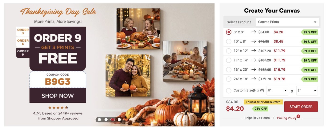
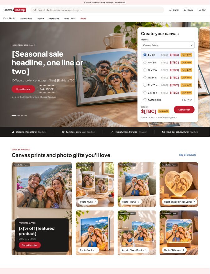
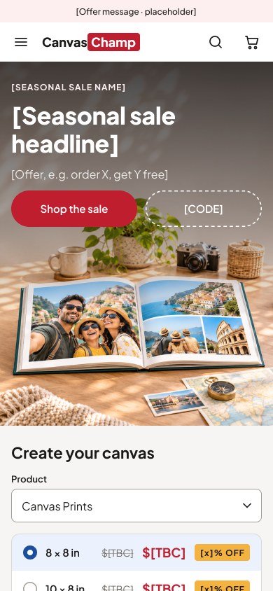
I led design across product pages, landing pages and customization flows, and mentored the team through continuous releases.
A clickable 24-screen Photo Book prototype with its own design system, built to give shoppers confidence before they pay. Usability testing is the next step.
People arrive with a holiday, a baby, a wedding. Then they face size, cover, paper, layout and image quality. Today's Photo Book tool makes those choices harder than they need to be.
First-time and repeat shoppers on desktop and mobile, from families and gift buyers to small businesses. Behind them, the marketing, development, QA and support teams who handle every unclear step.
A photo book is printed exactly as designed. A blurry photo, an empty page or a surprise fee missed on screen shows up when the book arrives, or the shopper gives up before buying.
CanvasChamp grew into a large catalogue of personalized products, each with its own sizes, materials, layouts and promotions. Keeping the experience clear got harder with every release.
I turned business needs into flows and responsive interfaces, prepared developer-ready designs, ran UI quality reviews, and mentored designers through urgent releases.
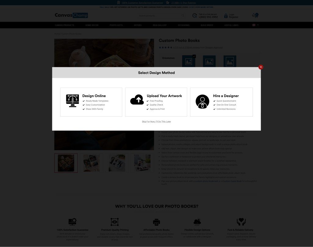
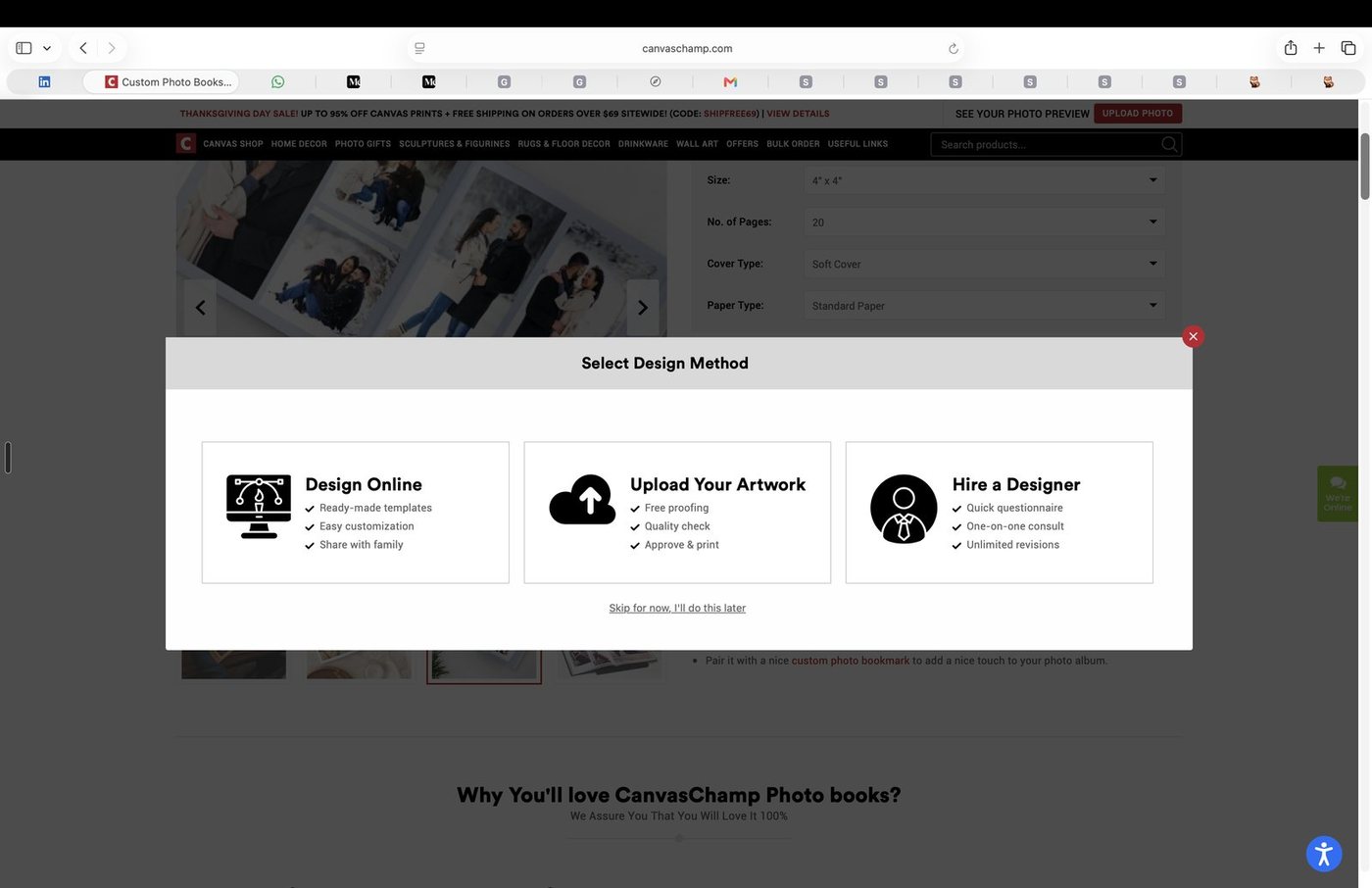
I designed the Photo Book product page with its Select Design Method pop-up, Hire a designer and Upload artwork flows. It went live. The Photo Book editor itself was designed by another CanvasChamp designer.
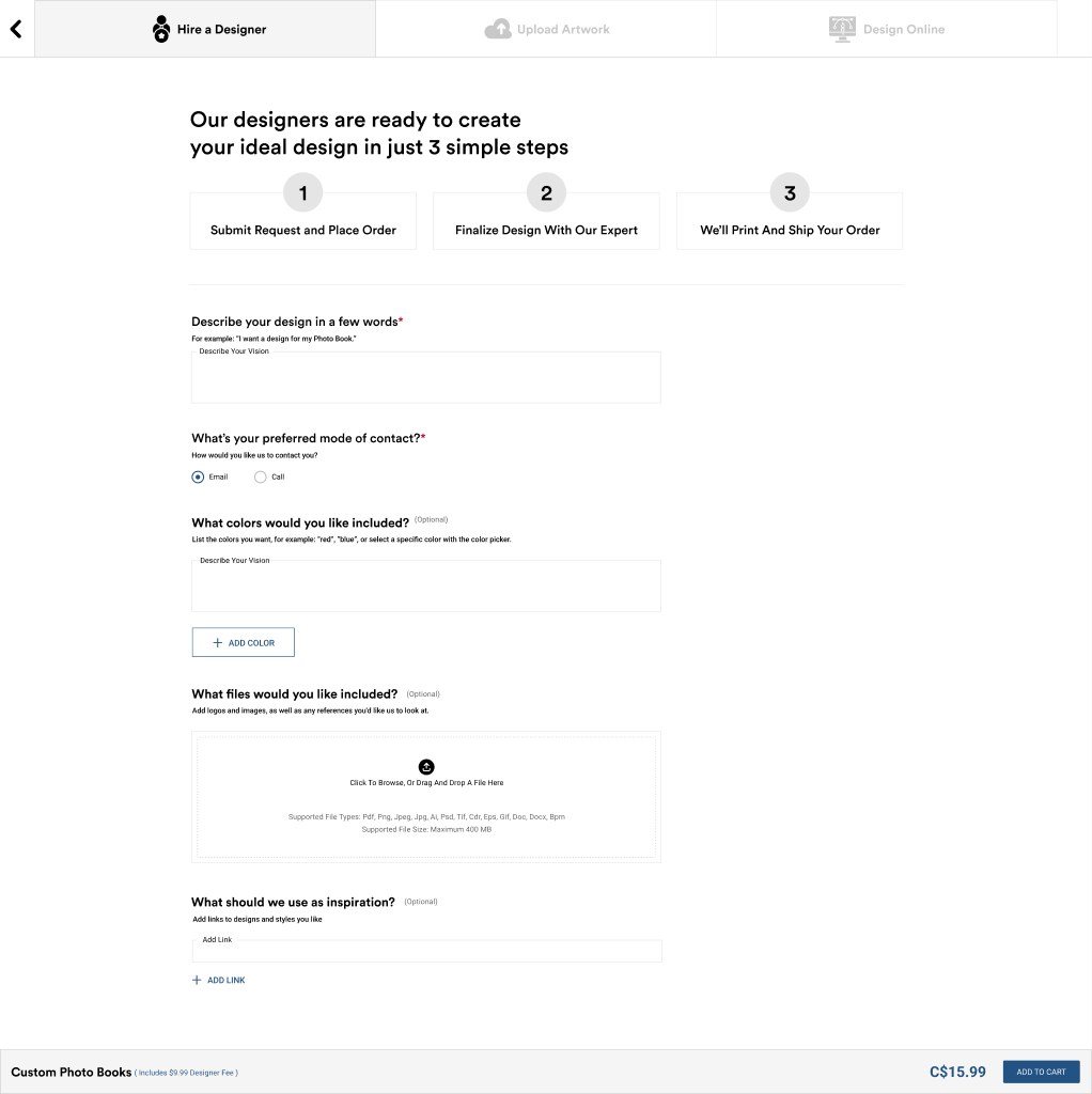
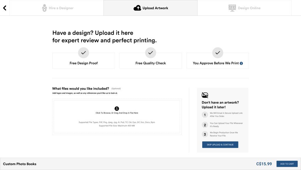
The client wanted to add new features to the Photo Book design tool, so I chose Photo Books as the focus for this concept. It also gave me the opportunity to revisit the design flow I had previously created and shipped. I plan to present the concept to the client; the decision to adopt it is theirs.
Adults turning personal photos into gifts and keepsakes: families, gift buyers, home-decor shoppers, photographers, small businesses.
Gift buyers, home decorators and small businesses, as hypotheses to test.
US first for the concept. UK, India, Australia, New Zealand and Canada later, with their own currency, units, payments and shipping.
At home, at work or travelling, with photos spread across phone, computer and cloud.
Desktop and mobile. The concept's desktop tool also takes photos from a phone by QR code.
Upload, cropping, layout, preview and price, especially with many photos or on a phone. Many shoppers need guidance on cropping, sizing and image quality.
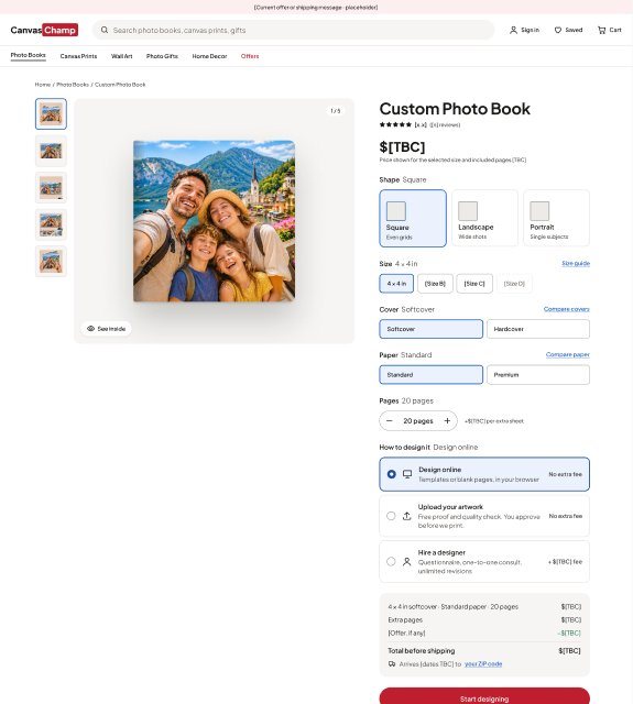
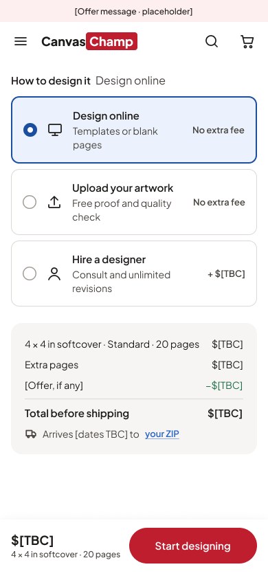
The design method (design online, upload artwork, hire a designer) moves from a pop-up into the buy box. A new listing lets shoppers choose a format before the tool.
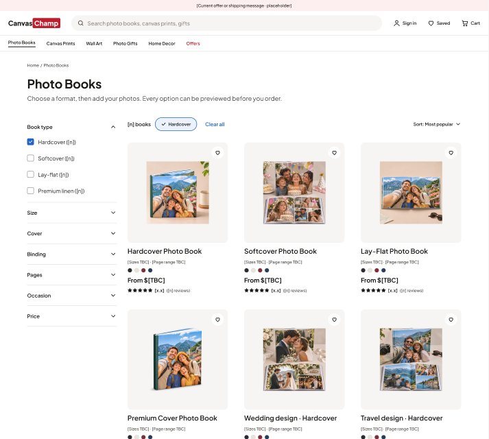
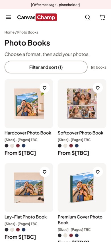
"Likely effect" is my expert assessment, not user research.
| Friction (live, Nov 2026) | Likely effect | Concept response |
|---|---|---|
| Dropdowns, then a separate design-method pop-up | Designer fee appears only after the shopper commits | Method and fee in the buy box, before "Start designing" |
| One page at a time | Hard to judge how facing pages work together | Spreads view, All pages, page strip with warnings |
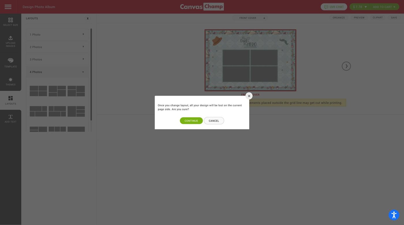
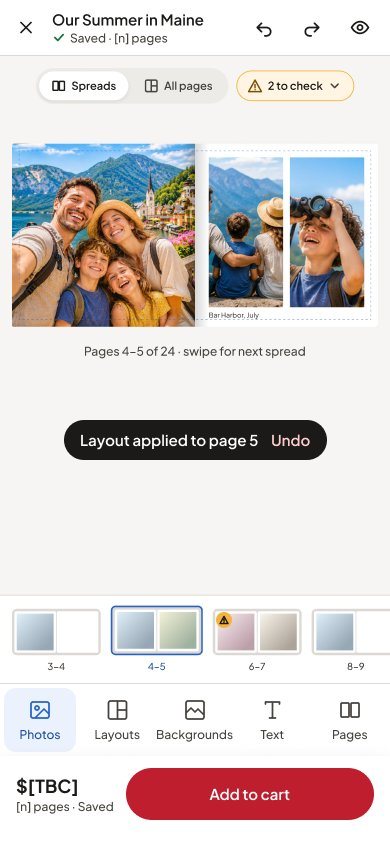
| Layout change warns the page will be lost | Shoppers may avoid trying layouts | Layout applies with a confirming toast |
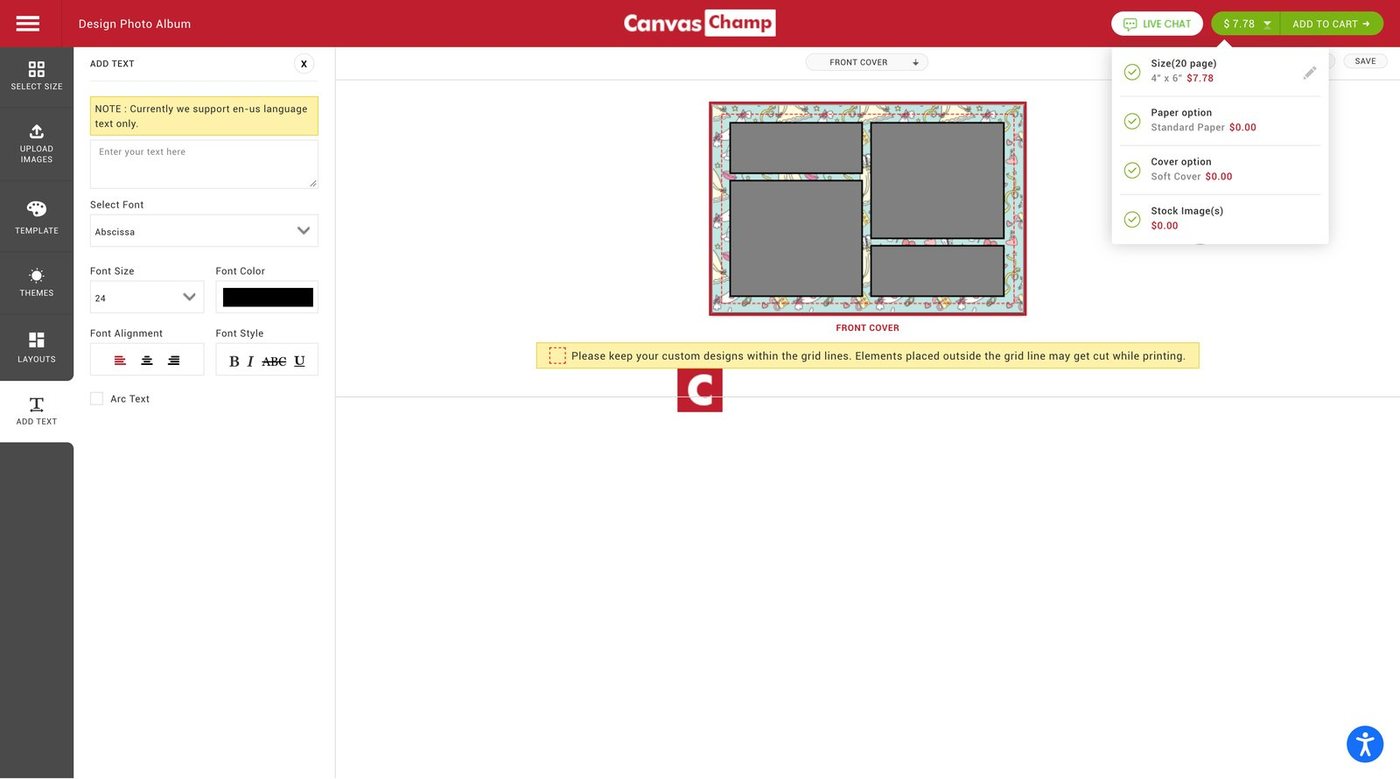
| Fixed note about grid lines | Quality issues aren't tied to the photo causing them | Inline "may print blurry" warning with Swap photo |
| Price breakdown in a header dropdown | The total's make-up is out of sight while designing | Price and page count stay in the top bar |
The concept aims for connection, confidence and reassurance.
How the visual direction supports it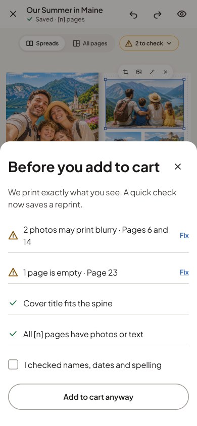
Steps 3 and 4 repeat. The workaround: comparing earlier choices in their head, because the tool didn't hold the answers in one place.
These are design intentions; whether they reduce re-checking is still to be tested.
The concept hasn't been tested yet, so this is the plan for measuring it.
An expert review of the live Photo Book tool and page (Nov 2026), labelled as expert assessment, and my own first-hand experience leading CanvasChamp design.
Planned, not done: moderated usability sessions on desktop and mobile, measuring:
Studied Snapfish for the editor and Zazzle for shopping, for patterns only. Kept what worked in CanvasChamp's tool: one tool rail, layouts grouped by photo count, phone upload.
Brand red kept, one typeface, blue for selection, amber for warnings, components for all four page types, and a reusable Photo Book image slot.
Option A restyled the live layout. Option B introduced new section styles and a Photo Books tile, and became the main flow.
A Photo Books listing so shoppers choose a format before the tool.
Shapes, 4 x 4 in, 20 pages, two covers, two papers, three design methods and 1 to 4 photos per page come from the live site. Prices, fees and delivery stay [TBC].
11 desktop and 13 mobile screens, wired from homepage to an add-to-cart end screen, with back and close links.
The live crop offers only zoom and rotation. In the concept, Crop shows its result straight away and a toast confirms it.
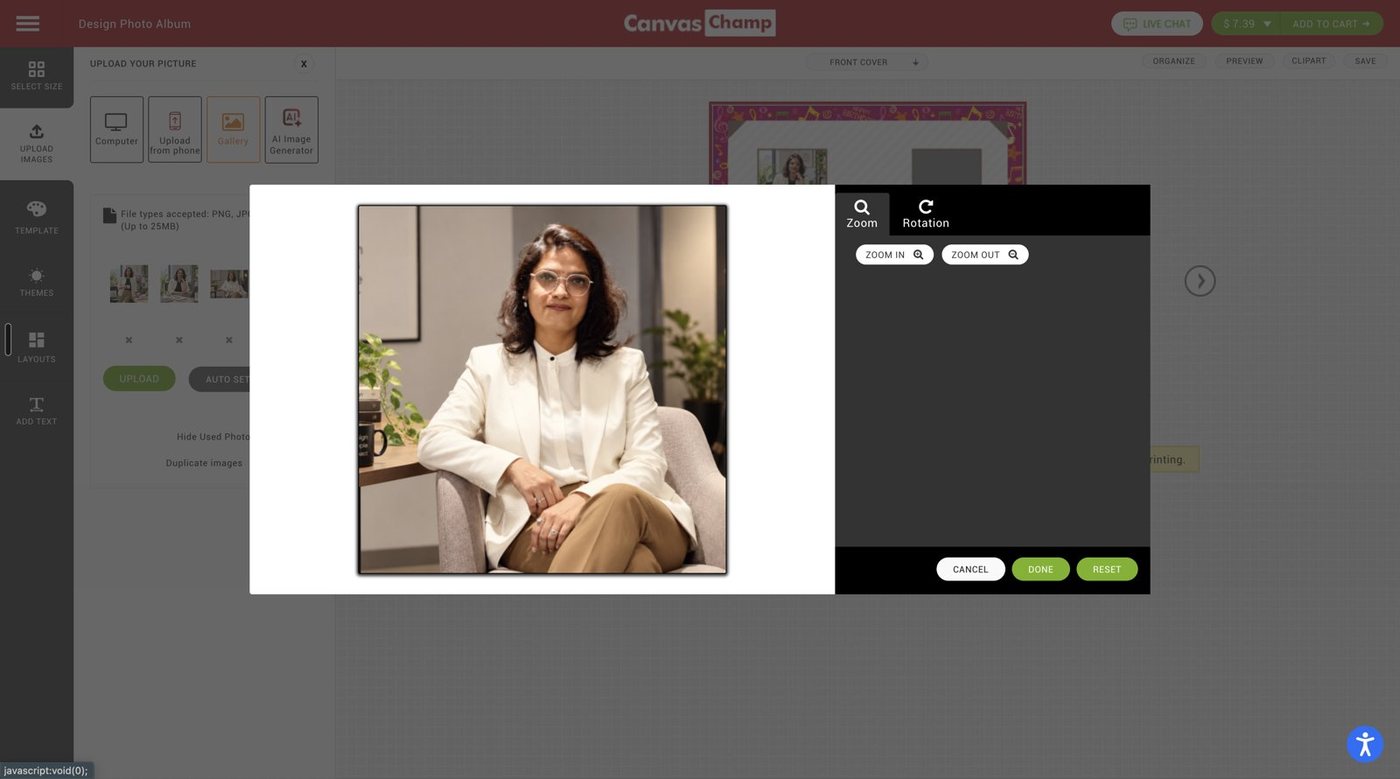
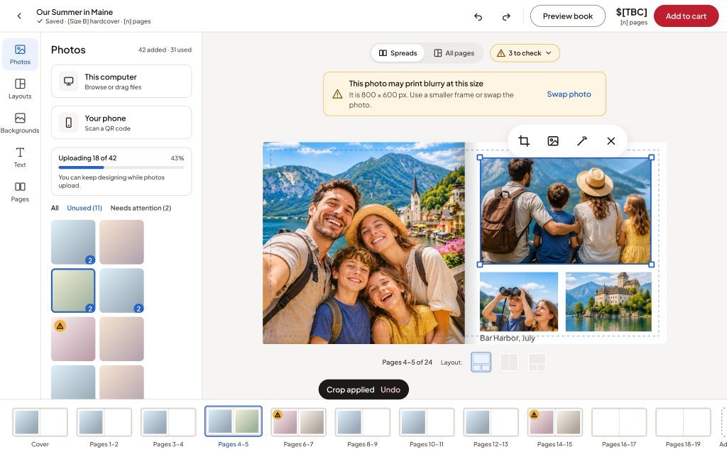
Grey panels show the live site. Red panels show the concept. The "Choosing options" before screens are my own shipped design (CCA-3967), so that pair shows me rethinking my own work. The editor before screens were designed by another CanvasChamp designer.
Dropdowns and a separate pop-up become one buy box with the method and fee.
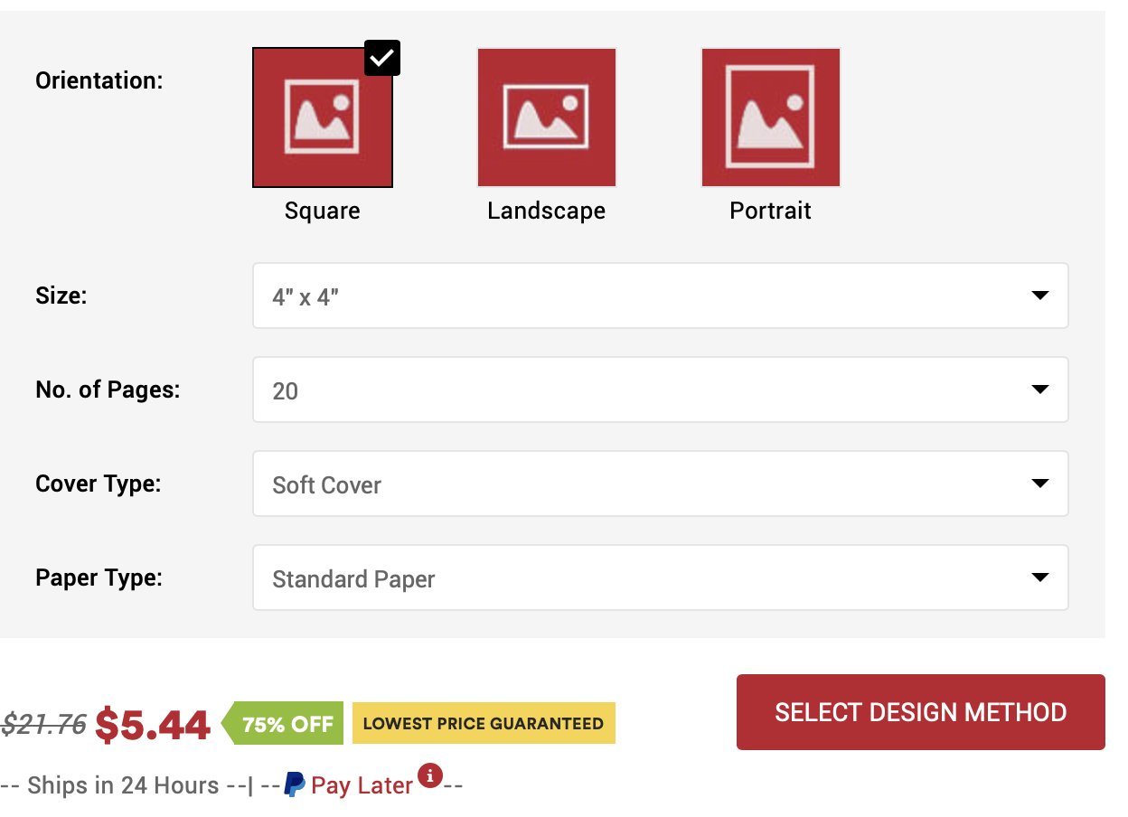
The tool no longer drops you on the front cover.
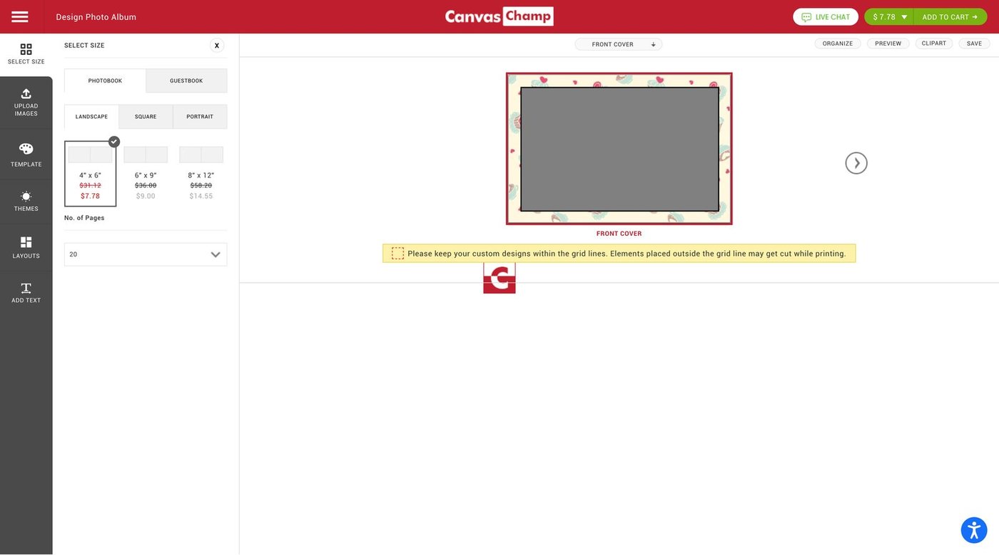
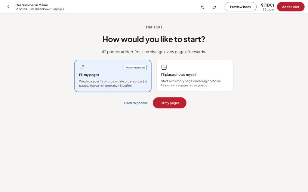
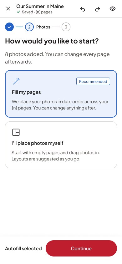
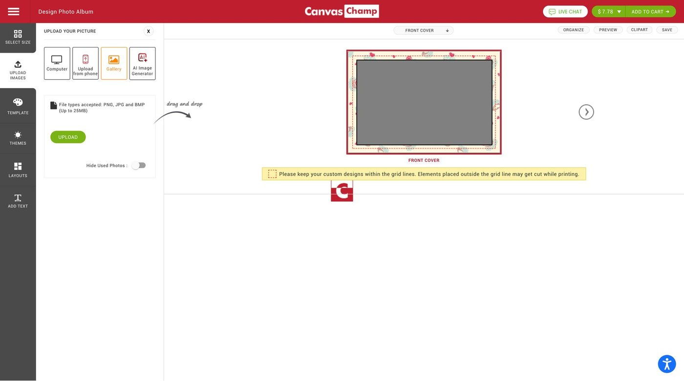
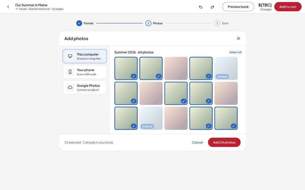
An upload panel inside the tool becomes a guided step.
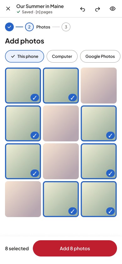
A destructive warning becomes a change you can see.
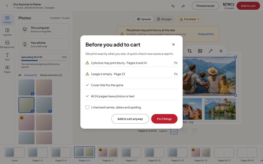
A hidden price breakdown becomes a review that names each issue.
One page at a time becomes spreads, a bottom tool bar, and price with Add to cart pinned.
Each user benefit is a design intention, not a measured result. Existing evidence is the live site as captured in Oct and Nov 2026.
| Area | Existing experience (evidence) | Proposed redesign | User benefit | Evidence/status |
|---|---|---|---|---|
| Homepage | Promo slider and "Create your canvas" panel; Photo Books is one tile in a discount-led grid | Full-width hero, quick-order panel, promise bar, product grid with a Photo Books tile | Products read as products; offers keep their own band | Observed · Concept, untested |
| Photo Books listing | No listing step; the Photo Book page leads straight into the tool | Format filters (type, size, cover, binding, pages, occasion, price), how it works, occasions | Compare formats before choosing | Observed · Concept, untested |
| Detail buy box | Dropdowns; design method in a pop-up; designer fee appears later | Option tiles; method and fee in the buy box; price summary; sticky buy bar | Full cost known before committing | Observed · Concept, untested |
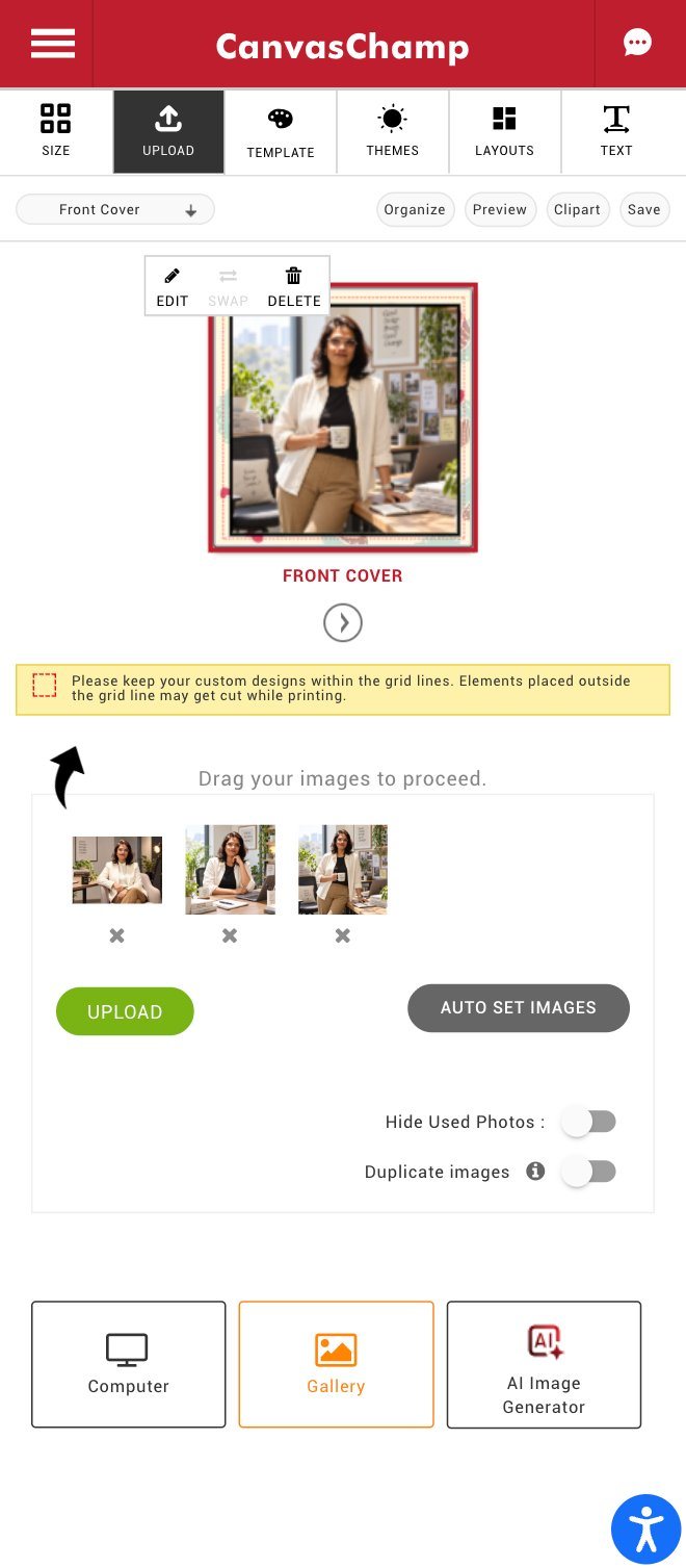
| Adding photos | Upload panel inside the tool, with several sources and duplicate toggles | Step 2 of 3 picker with counts and "already in your book"; uploads continue while designing | Less waiting, fewer duplicates | Observed · Concept, untested |
| Starting the book | Opens on the front cover; "Auto set images" sits in the upload panel | Start choice: Fill my pages (recommended) or place photos myself | Autofill as a clear first choice, with control kept | Observed · Concept, untested |
| Editing view | One page at a time | Spreads and All pages, page strip with warning badges | See the book as it opens | Observed · Concept, untested |
| Layout change | Warning that the page design will be lost | Layout panel; result applies with a toast | Safe to try layouts | Observed · Concept; Undo is a label only |
| Crop | Modal with zoom and rotation only | Crop panel from the photo toolbar; result shown in place | Control over what's in frame | Observed · Concept, untested |
| Print quality | Fixed note about grid lines | Inline "may print blurry" warning with pixel size and Swap photo | Problem and fix in one place | Observed · Concept, untested |
| Price | Breakdown in a header dropdown | Price and page count always visible; one red primary action | Cost stays in view | Observed · Concept, prices [TBC] |
| Pre-purchase check | Not seen in captures | "Before you add to cart" list with Fix links | Catch mistakes before printing | Concept, untested |
| Mobile Photo Book | Tabbed tools; one page at a time; grid-line note | Bottom tool bar, a "swipe for next spread" hint, price and Add to cart pinned | Full editing on a phone | Observed · Concept, untested |
Concept, not launched or user-tested. Prices and delivery shown as [TBC]. Figma screens produced with AI assistance under my direction.
UX case study · V1 hackathon, 2026 → V2 product design
 EduSight
Accessible learning that tells each teacher what a child knows, and what should happen next.
See the screensTry the prototypes
Tools used
How might we help teachers track the learning progress of visually impaired children aged 6 to 14, identify individual skill gaps, and determine the next learning steps for each child?
The approved statement for both versions. Every section below traces back to one of these three verbs.

01 Project overview
EduSight helps teachers of blind and low-vision children aged 6 to 14 see what each child can do, spot the skill that is holding them back, and choose one clear next step. Children learn by ear from their own teacher's recorded voice, then practise and hear feedback.

02 Context
We spent our field visits at a school for blind students in Gujarat, India, in classrooms and in conversation with teachers.

03 Problem and solution
Teachers can give a score, but not say which skill broke or what to teach next. EduSight's answer connects evidence, gap and next step in one loop.
04 Design thinking process
The stages ran once for the V1 hackathon and again for V2. Only activities with a record in FigJam, Drive or Figma are listed.
Review fed back into Define twice: once after mentor critique, once when V2 widened the product to four roles.
05 Project timeline
Solid bars use dates recorded on files and boards. Dashed bars mark phases whose exact start or end wasn't recorded.
06 User research
Each finding is labelled by where it came from, so a field observation is never confused with an AI summary or a team assumption.
Classroom observation and teacher conversations at a school for blind students in Gujarat, India, in 2026.
FieldConversations with three blind teachers. Captured as team notes in FigJam.
FieldApps in current use, government systems, assistive devices and published studies on motivation.
SecondaryNotebookLM mind maps and summaries organised the field notes. Used only where they agree with sources 1 and 2.
AI-assistedUnderstand how teachers of blind children follow each child's learning today, and where that breaks down.
Semi-structured conversations and classroom observation, written up as bullet-point team notes. Not recorded as verbatim transcripts.
Three blind teachers and observed classes of blind and low-vision students. No names, subjects or other identifying details are published.
Tracking and records · teaching visual concepts · tools and screen readers · paperwork · parents and home learning.
Bullet-point notes in the note-taker's own words, not recorded quotes. Class sizes and grades are left out so the school can't be identified.
One site, a small sample and paraphrased notes. Original recordings exist but were not re-transcribed for this case study.
Teacher A
Teacher B
Teacher C
Students worked on laptops in pairs; classrooms mixed Braille books with laptops.
FieldSome children have other disabilities too, so a next step has to be set per child, not per grade.
FieldApps in use host videos and textbooks but have no practice, feedback or saved progress.
AI-assistedSome children replay a lesson four or five times, and respond best to their own teacher's voice.
AI-assistedNo survey or measurement study was run. This project's evidence is qualitative, so there are no response counts or charts here.
The hackathon board held some population figures and device-usage percentages. The board itself labels the percentages as planning benchmarks needing field validation, and the population figures cover all disabilities, not blindness alone, so they are left out.
Teachers can give a score but not which skill broke or what to teach next. The apps teachers described track marks, not skills.
Some children need to hear a lesson several times, and a familiar voice may help more than new content.
Every teacher screen has to work with a screen reader, not only the student screens. This changed the whole staff side of the product.
Field: all three teachers
The gap follows the child home. Parents need to know what to practise, not only the marks.
Teachers already fill in several mandatory systems. EduSight must not become one more.
Method note: insights come from team field notes from visits to a school for blind students in Gujarat, India, and conversations with three blind teachers. AI tools (NotebookLM and ChatGPT) were used to organise notes and make early explorations; their outputs were checked against the team's own notes. The original recordings were not re-transcribed for this case study.
07 Define
The define work sits on the hackathon FigJam board. Where a card is the team's own reasoning rather than something a teacher said, it is labelled.
These four personas were written for the V1 hackathon with AI help, from the team's field notes. They are composites, not real people. All four are illustrations, not real people: the teachers are drawn characters and the students are shown as Pip, so no photograph or photo-style image is used. Ages and the source's "research confidence" ratings are left out because no original evidence supports them.


Progress sits in memory, forms and mandatory apps that don't talk to each other.
Apps show that content was opened, not whether it was understood.
Skills and their prerequisites aren't connected, so support may target the wrong difficulty.
Recording is separate from teaching, so records go stale.
Pictures are skipped by screen readers; videos teach silently on a board.
Home practice depends on how much each parent can follow.
| Root problem | Surface | Root cause | Consequence | Opportunity |
|---|---|---|---|---|
| Marks without meaning | Teachers can record marks | Records are score-based, not skill-based | Individual progress stays unclear | Turn assessments into skill-level progress |
| Gaps are hard to locate | Learning gaps are hard to name | Skills and prerequisites aren't connected | Support may target the wrong difficulty | A structured skill map |
| Next step takes time | Deciding what to teach is slow | Results are disconnected from objectives | Children wait longer for the right help | Connect every gap to a next step |
| Recording adds work | Updates need extra effort | Recording is separate from teaching | Records become incomplete or outdated | Fast, phone-friendly capture |
| Improvement is hard to see | Progress is hard to show | Results from different attempts are scattered | Interventions are hard to judge | A simple skill-progress timeline |
The "children wait longer" consequence is my inference; the board left that cell blank.
| Row | Prepare−1 | Conduct activity0 | Observe and assess−1 | Record−1 | Identify gap−2 | Decide next step−2 | Reassess+1 |
|---|---|---|---|---|---|---|---|
| Goal | Understand the child's current level | Help the child practise a skill | Understand performance | Save the result | Find where support is needed | Choose what to teach next | Check whether the child improved |
| Action | Review notes, remember past work | Braille, tactile, audio or practical activity | Watch accuracy, confidence and support needed | Write it down in a separate place | Compare results | Pick an activity | Assess again |
| Thought | "What did this child complete last time?" | "Is this activity right for this child?" | (none recorded) | (none recorded) | "What is stopping this child?" | "Which activity should I try next?" | "Is this approach working?" |
| Pain point | Information is scattered or out of date | Activity may not match ability | Depends on subjective observation | Takes extra time | Marks don't explain the gap | Results aren't linked to next steps | Improvement is hard to see |
| Opportunity | Child status understood in 30 seconds | Activities matched to the skill | One-tap status with a short note | Recorded within one minute | Link results to prerequisite skills | One objective, one accessible activity | Show change across attempts |
Thoughts are written by the team on the FigJam board, not quoted from teachers. Opportunities come from the board's "moments that matter".
I assess a child during a learning activity,
quickly understand their current skill level and learning gap,
I can select the right next learning objective and activity.
How might we help teachers track the learning progress of visually impaired children aged 6 to 14, identify individual skill gaps, and determine the next learning steps for each child?
Early drafts covered organisations, regions and daily independence. The final statement narrows to one user, the teacher, and one job: learning. Adding "next" turned a record into a decision.
08 Ideate
The team generated concepts against the opportunity areas, scored them, took mentor critique, and chose the direction that answered the problem statement most directly.
Opportunity areas on the board: Skill Intelligence (priority 1), Adaptive Learning (priority 2), Accessible Active Practice, Multimodal Learning and School–Home Continuity. Key question: "What does this child know now, and what should happen next?"
Why the winner won, in the board's words: strongest research evidence, directly answers the problem statement, and a clear hackathon demo story.
"This is working. It solves the stated problem." The flow was "well laid out with voice and touch tracks".
Show more research evidence with pictures, videos and figures. Explore more opportunities; adaptive learning alone felt generic.
Compass is "a very good idea"; add voice feedback, vibration or haptics. Try gamification and points. Rephrase the key insight with the user need.
What changed in response: the key insight was rewritten around the user need, and points became badges and certificates (see section 15). Haptic feedback was not carried into V2 and remains an open idea.
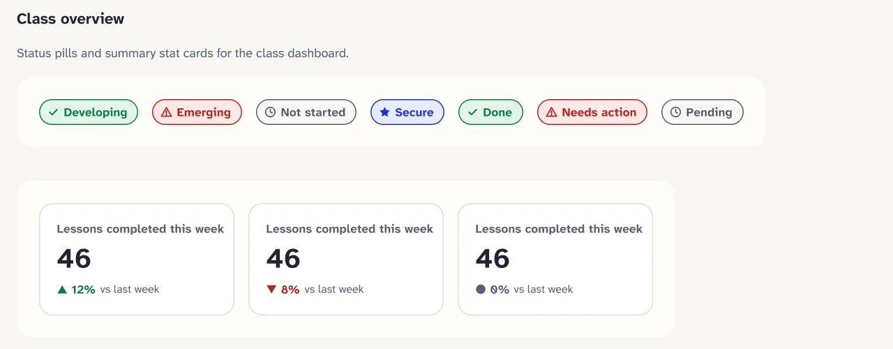
This is the V1 skill logic from the team board. V2 renamed the states Secure, Developing, Emerging and Not started.
V1 IA from the team's sketch, for comparison: students had Home, Learn (recorded class), Progress and Help; teachers had Home, Lessons, Progress (attendance) and Help (review questions). No admin or guardian role existed.
The teacher flow and its alternate and error paths come from the team's FigJam flow. Student, authoring, admin and guardian flows are read from the V2 prototype.
09 V1 · hackathon, 2026
The concept was renamed twice as it took shape. The loop it promised stayed the same.

10 V1 to V2
V2 is designed as a full learning platform for schools. Each change is tagged: Feedback came from the field or mentors, Product came from taking the idea to production.
| Area | V1 hackathon | V2 design | Why |
|---|---|---|---|
| Lesson audio | Browser text-to-speech | Teacher records or uploads their own voice, part by part, with a transcript | Feedback |
| Teachers | Sighted-first screens | Screen-reader-first staff screens on desktop and phone | Feedback |
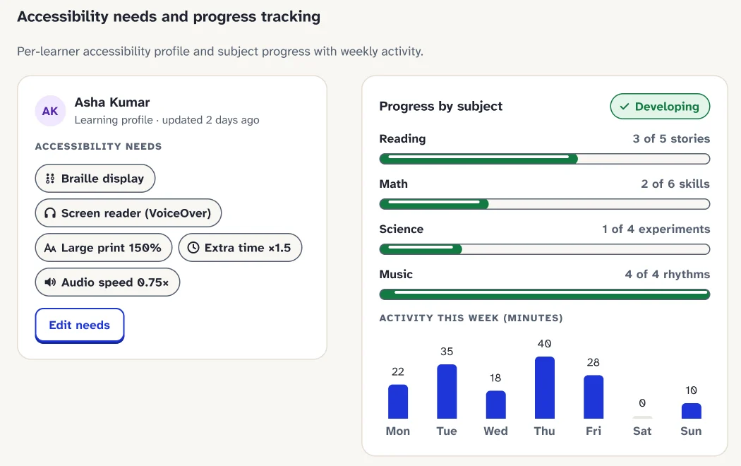
| Progress | One score, three labels | Per-outcome status (Secure, Developing, Emerging, Not started) backed by observations | Feedback |
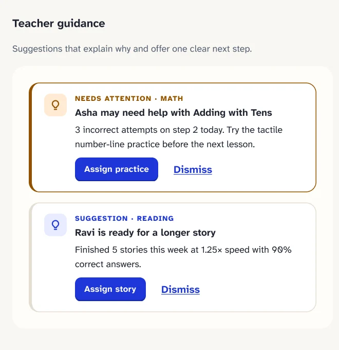
| Next step | Teacher assigns a lesson | "Needs attention" list with a "Why you see this" line | Product |
| Roles | Student and teacher | Student, teacher, school administrator and guardian | Feedback Product |
| Rewards | Points idea from critique | Badges and certificates designed; cash awards a proposal only | Feedback Product |
| Language | English | English and Gujarati planned from the start | Product |
| Privacy | Not covered | Consent centre, school isolation, guardian one-time code | Product |
| AI | Simulated processing | No simulated AI; suggestions follow rules the teacher can see and change | Product |
11 From insight to decision
| What we saw | What teachers need | What V2 designs |
|---|---|---|
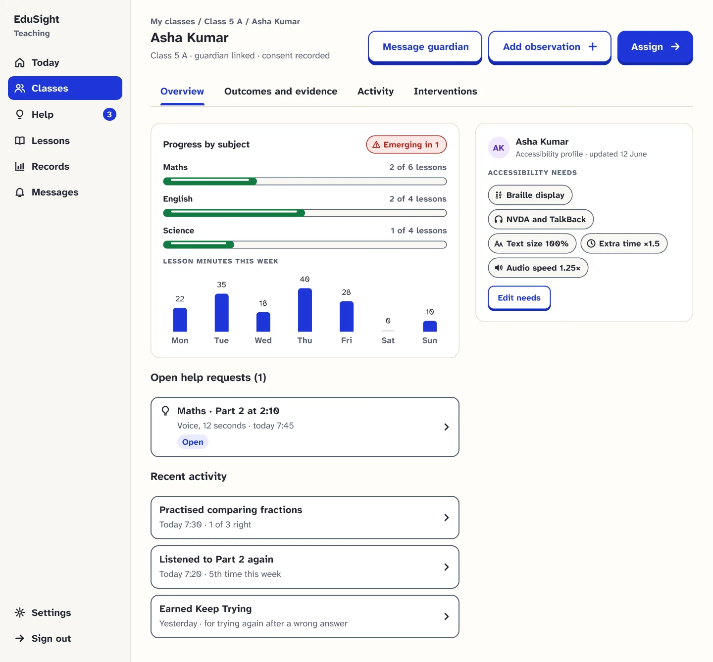
| Progress lives in the teacher's memory | See what each child can do now | Student overview with progress by subject and outcome status |
| Results don't lead to action | One clear next step | "Needs attention" cards with a plain "Why you see this" line |
| Recording adds work | Record in under a minute | One-screen "Add observation" with status and a short note |
| Children replay their teacher's explanation | Record once, replay often | Teacher recording in short parts; student player with "Replay this part" |
| Teachers may be blind | Tools that work with a screen reader | Keyboard-first authoring, spoken status messages, visible focus everywhere |
| Learning continues at home | Parents know what to practise | Guardian app with plain-language progress and teacher messages |
12 Style guide
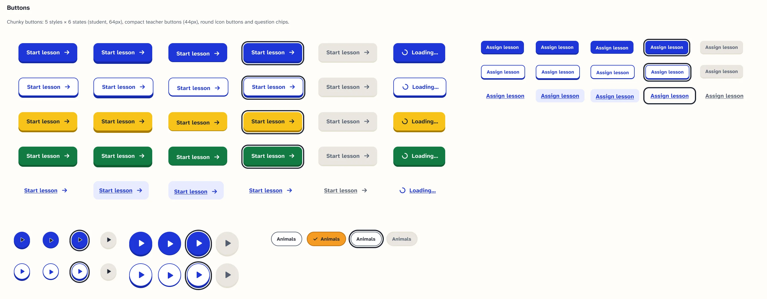
The V2 design system in Figma: tokens, components and rules, all approved on 1 November 2026. Values below are copied from the Figma pages.
#1F36D9#F6C21A#F59A23#137B43#6E35D8#C3286D#1BA8D7#B3261E| Sample | Pairing | Ratio | Result |
|---|---|---|---|
| Aa | Primary text on canvas | 15.26 : 1 | AAA |
| Aa | Secondary text on canvas | 6.27 : 1 | AA |
| Aa | White on primary button | 8.11 : 1 | AAA |
| Aa | Ink on reward yellow | 9.35 : 1 | AAA |
| Aa | White on success green | 5.33 : 1 | AA |
| Aa | White on reading purple | 6.64 : 1 | AA |
| Aa | White on music pink | 5.46 : 1 | AA |
| Aa | Ink on quiz orange | 7.84 : 1 | AAA |
| Aa | Ink on listening cyan | 5.64 : 1 | AA |
| ■ | Reward yellow as a fill against the page | 1.63 : 1 | Advisory: decorative only, never the only cue |
The full ramp also has Display XL 56/64, Display M 30/38, Heading 3 19/26, Label M 17/22 and an underlined link style. Nothing a student reads is smaller than 16 px.
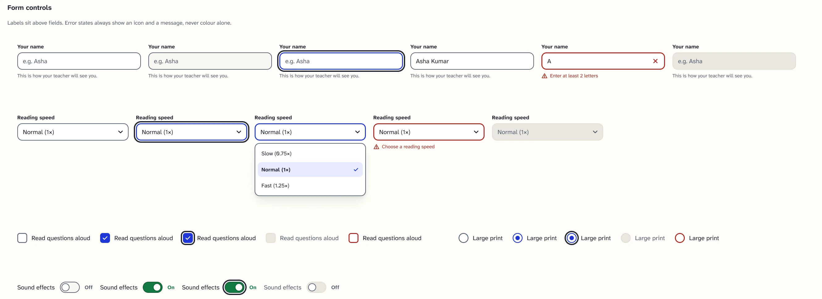

Checked in Figma only. Testing with TalkBack, NVDA and JAWS is still to do.


Two more poses, Greeting and Waiting, are drafted in Figma and waiting for sign-off.
13 App UI
Sixty-four prototype screens across five journeys, plus the shared states that keep every role out of dead ends. All screens are V2 Figma designs with sample data; nothing here is built yet.
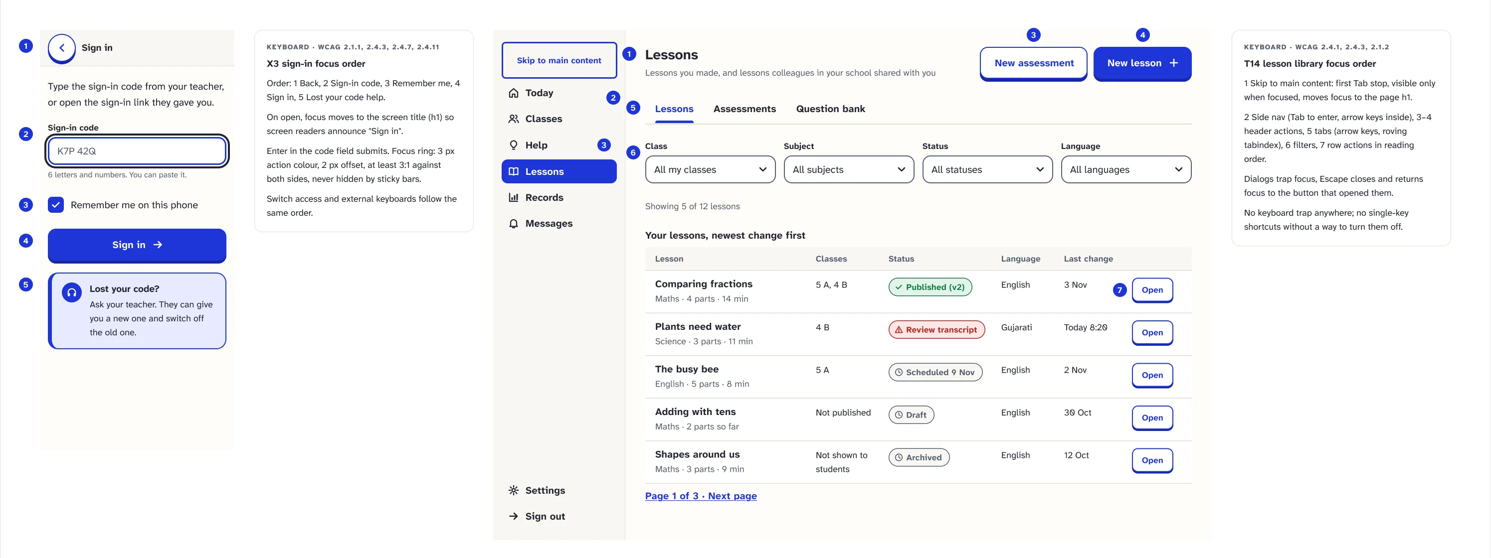
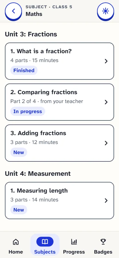
Phone · 16 screens · sign in, learn, practise, feedback, progress
1 Sign in Language first, then a code
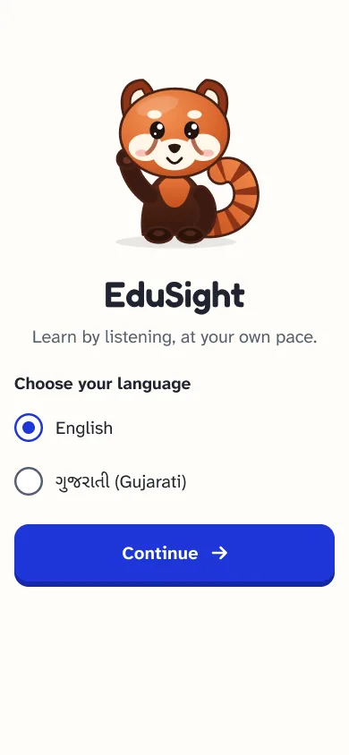
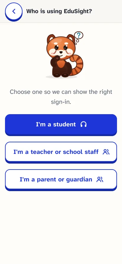
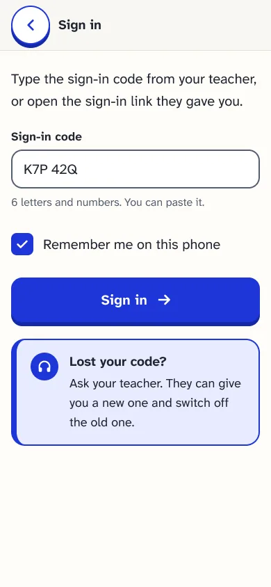
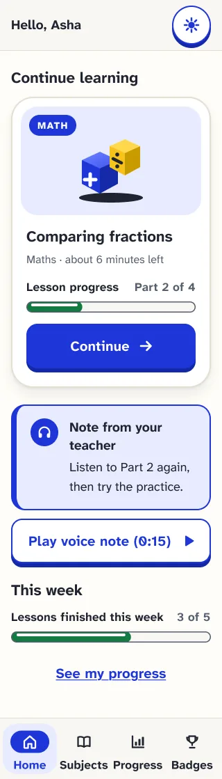
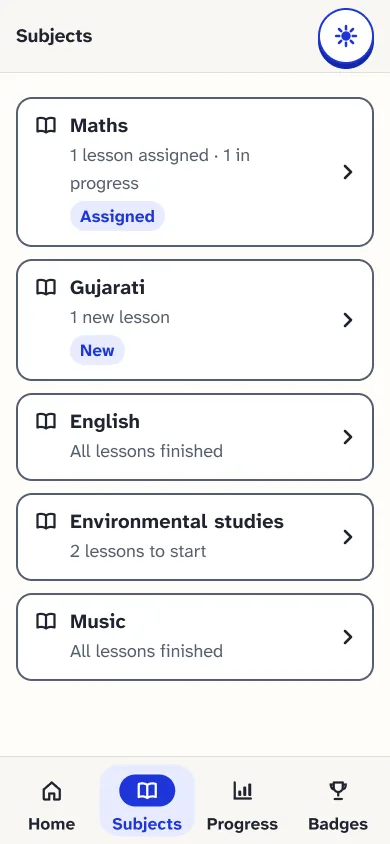
2 Find a lesson Home, subjects, lesson list
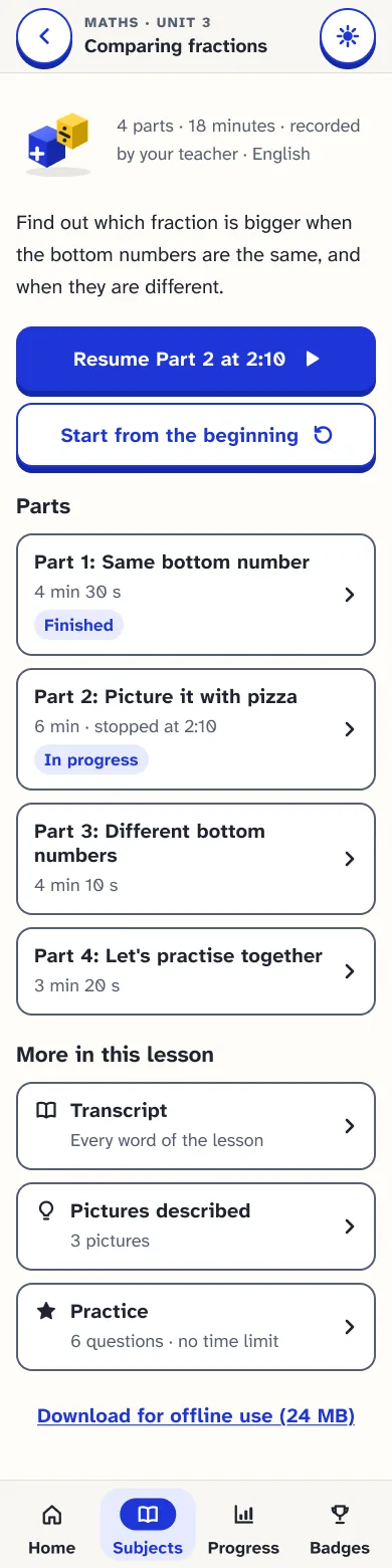
3 Learn In the teacher's own voice
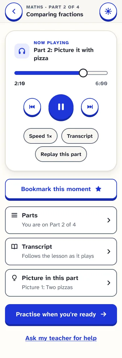
4 Practise One question at a time
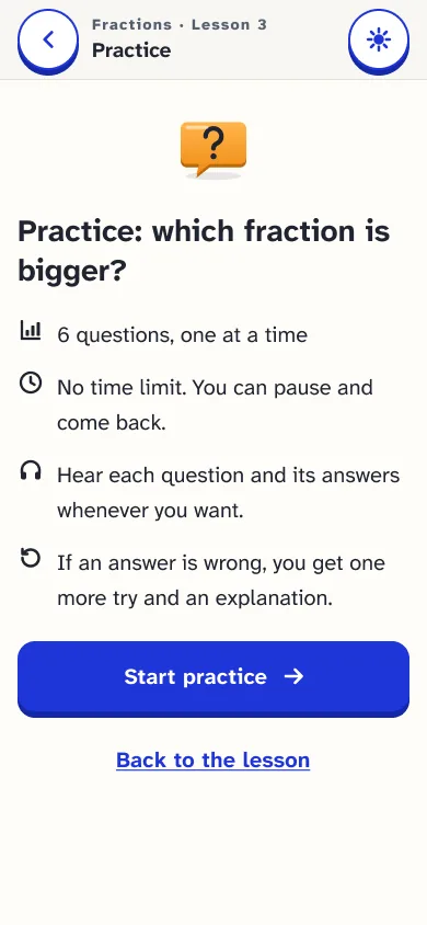
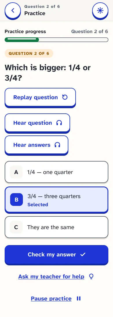
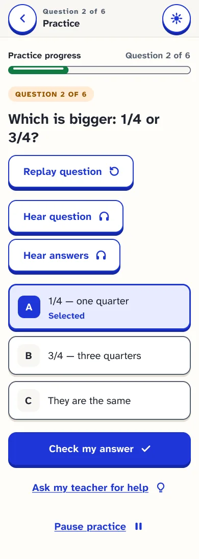
5 Feedback Encouraging, never punishing
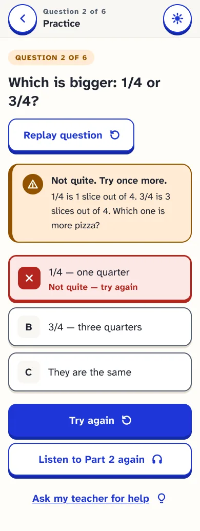
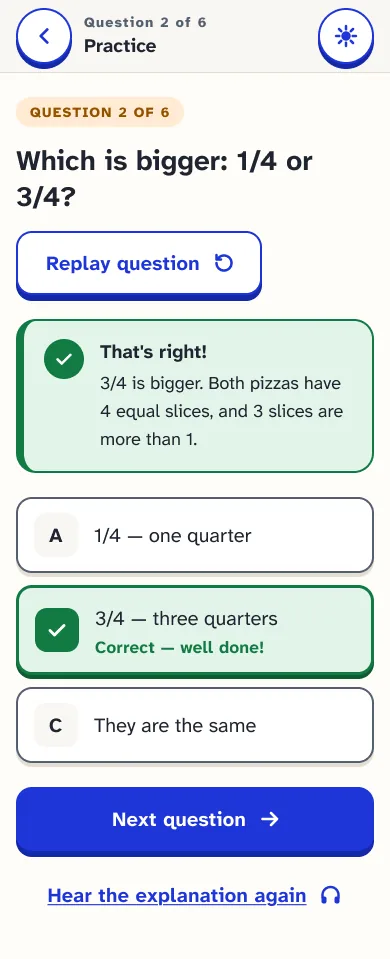
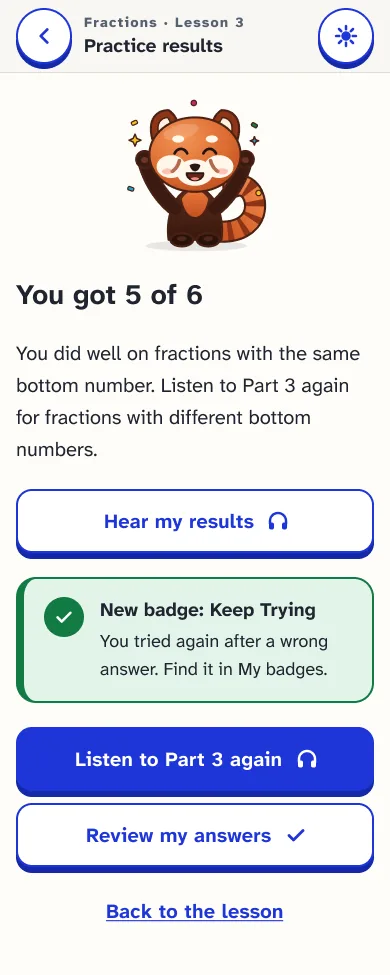
6 Progress What I can do now
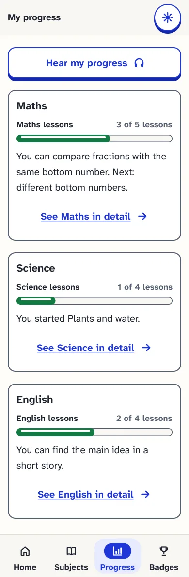
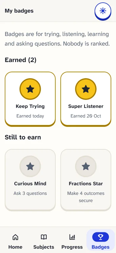
Desktop · 7 screens · choose a screen to see it at full length
Desktop · 16 screens · from recording to publishing
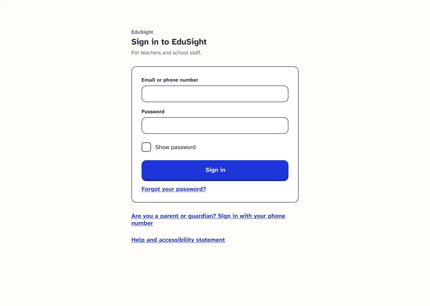
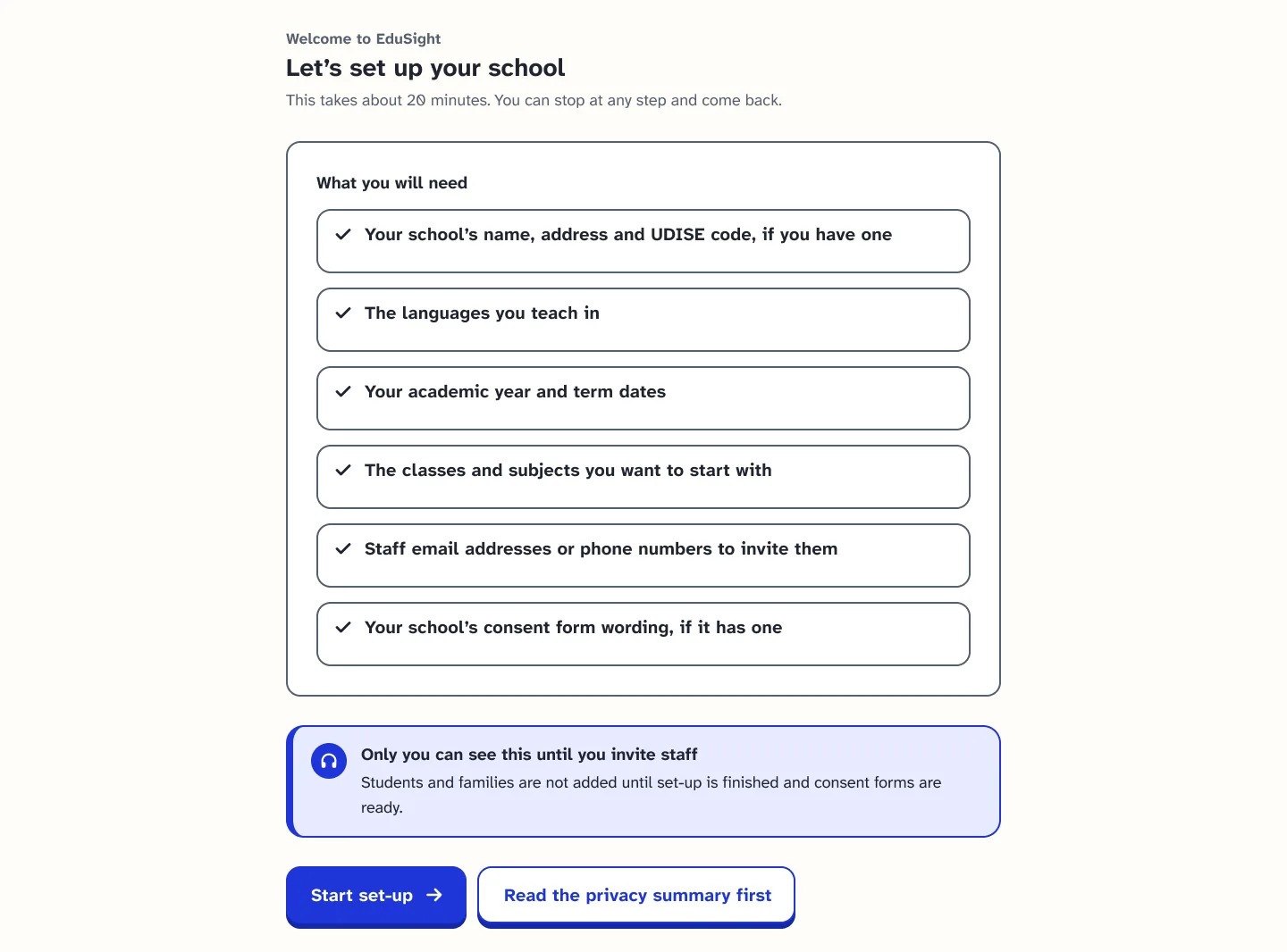
Desktop · 14 screens · set-up, people and records
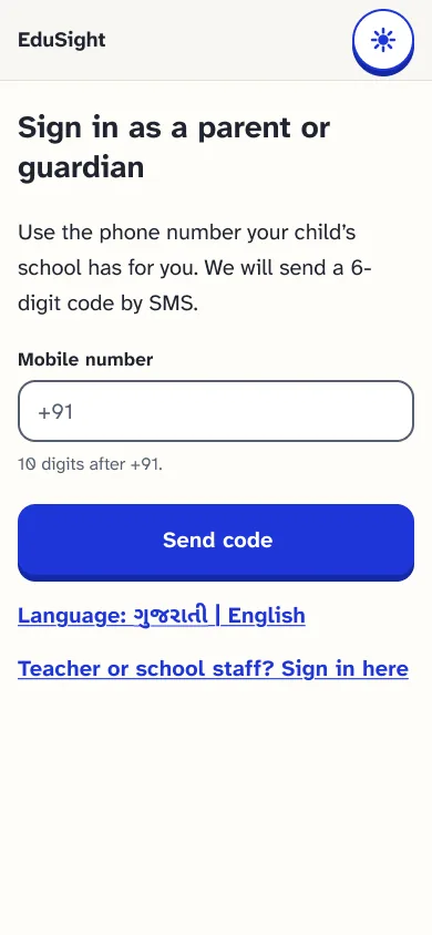
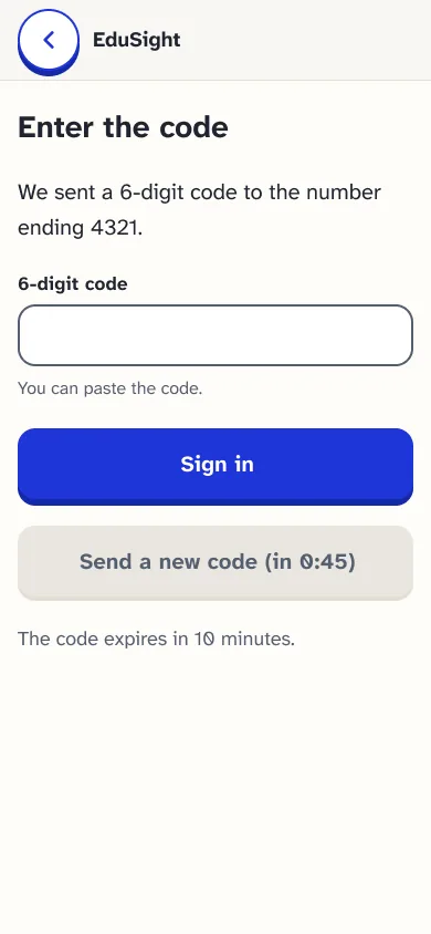
Phone · 11 screens · progress, messages and consent
1 Sign in Phone number and a one-time code
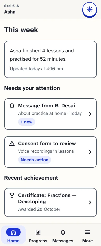
2 Follow progress Plain language, no jargon
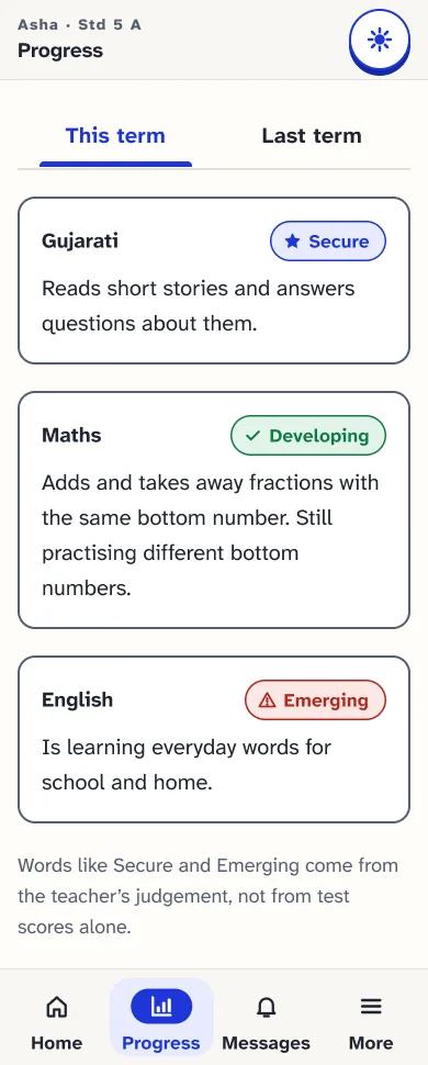
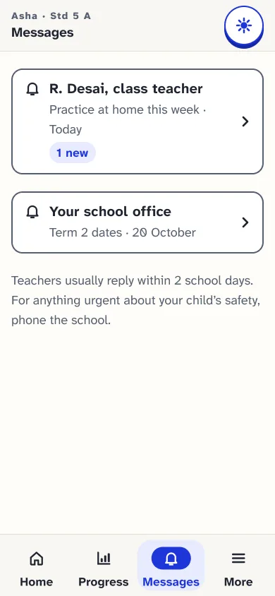
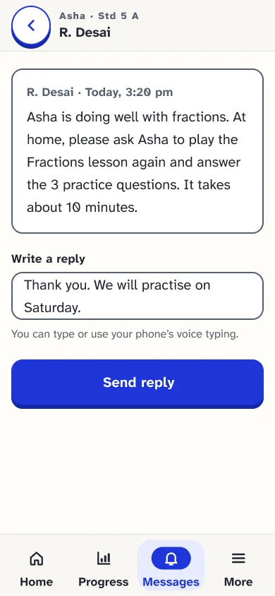
3 Stay in control Messages and consent
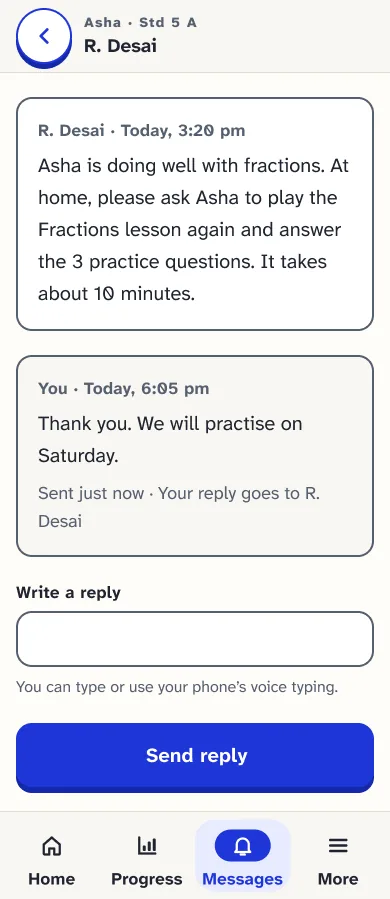
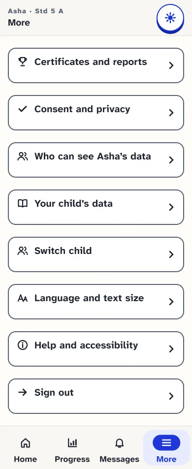
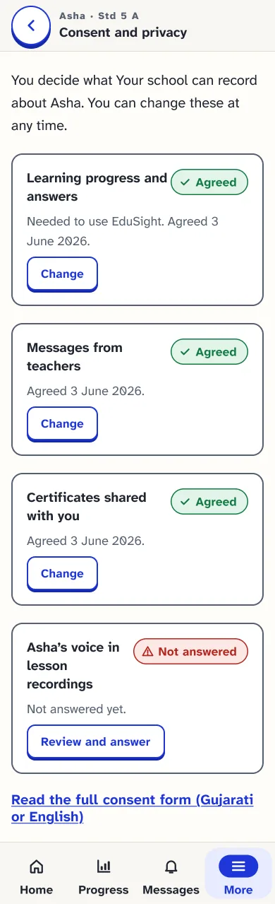
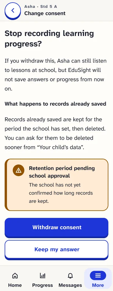
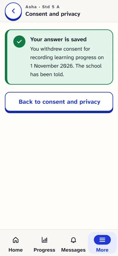
4 Change consent Confirm, then a clear receipt
Empty, loading, error, offline, recovery and responsive
Phone Offline, empty and error states
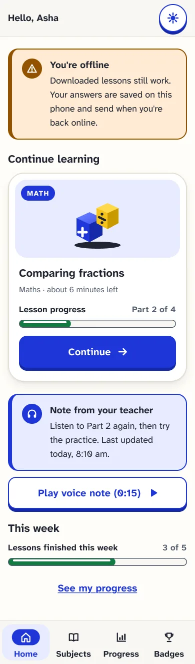
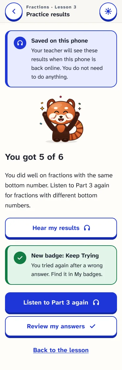
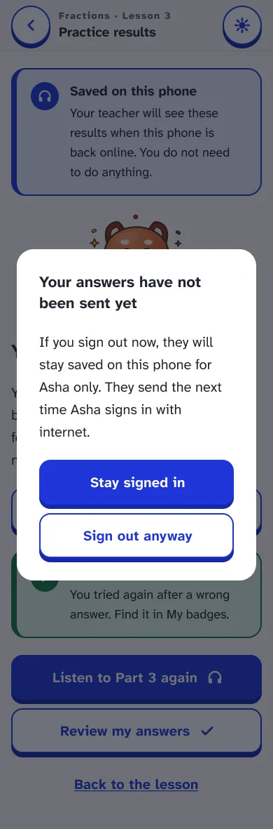
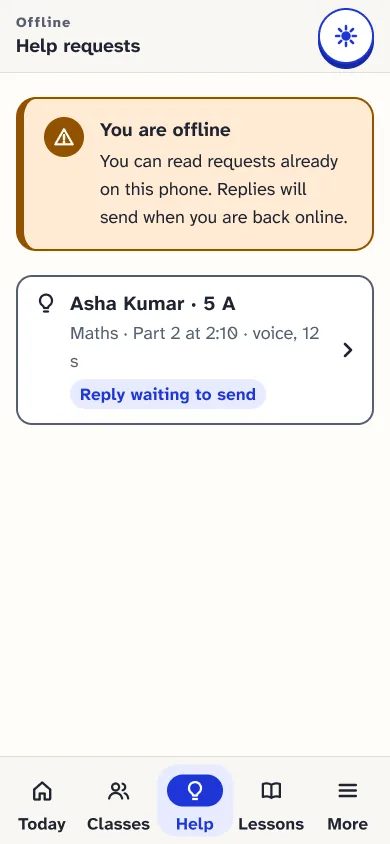
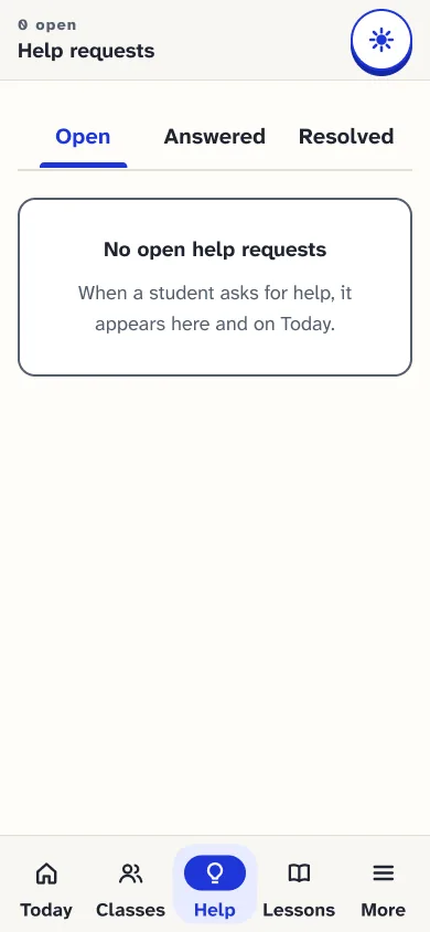
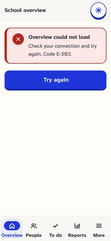
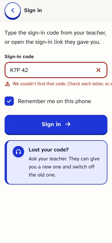
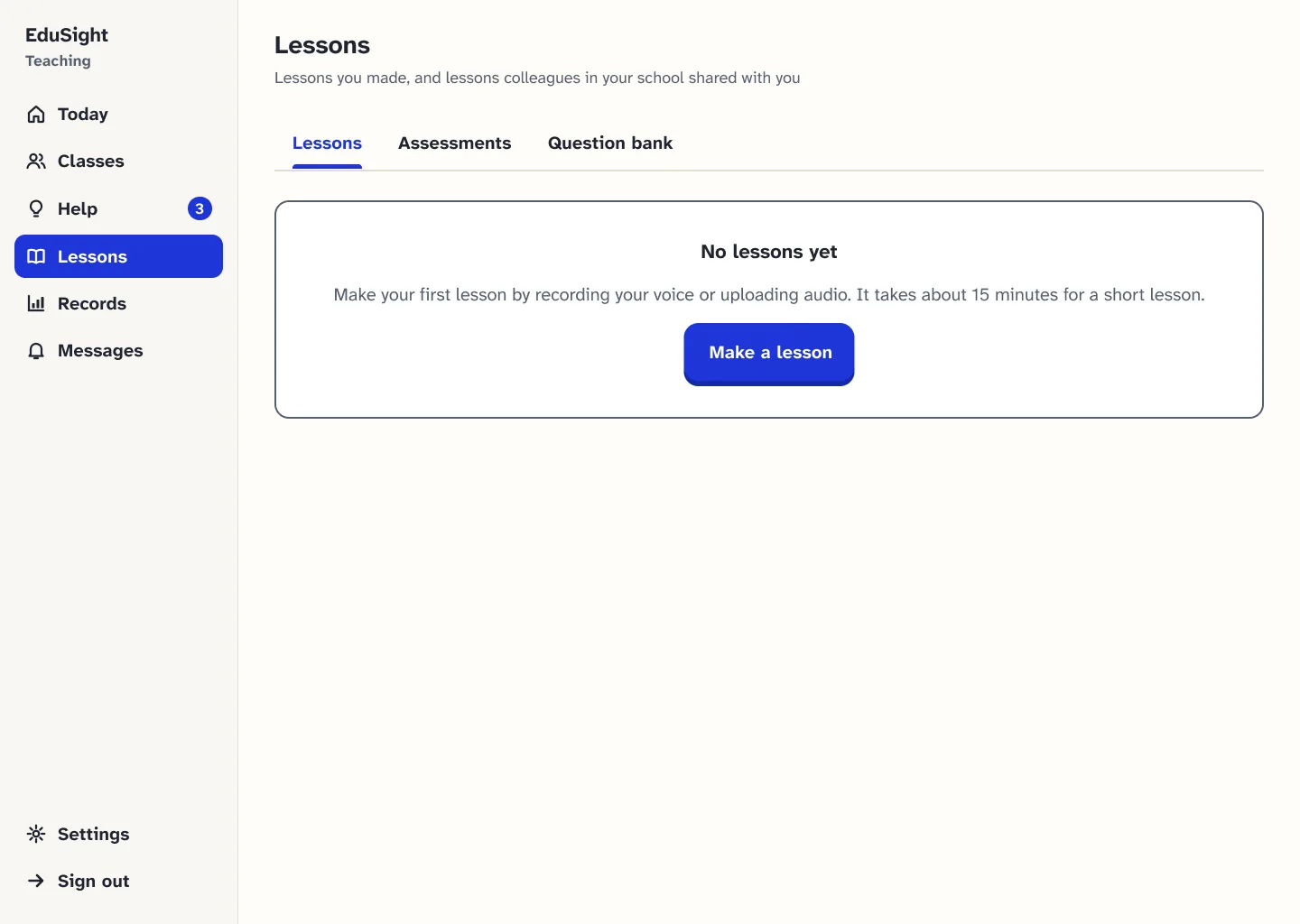
Responsive frames (reflow at 320 px and text at 200%) are shown in the style guide, section 12F. Teacher phone layouts exist in Figma but are not exported here.
14 Interactive prototype
Each link opens a Figma prototype at the start of one journey. These are design prototypes, not a deployed app.
Sign in, open a lesson, listen, practise and see results.
16 screensOpen student journey: Learning, Figma prototype, opens in a new tabRecord a lesson in your own voice, review and publish it.
16 screensOpen teacher journey: Lesson authoring, Figma prototype, opens in a new tabSee who needs attention, add an observation, answer help.
7 screensOpen teacher journey: Tracking and help, Figma prototype, opens in a new tabSet up the school in 8 steps and link guardians.
14 screensOpen school admin journey: Set-up and records, Figma prototype, opens in a new tabSign in with a code, follow progress, manage consent.
11 screensOpen guardian journey: Progress and consent, Figma prototype, opens in a new tabViewing may need access to the Figma file. Best viewed on a laptop; phone journeys open at phone size.
15 A considered decision
What is designed, what is only proposed, and what no one has approved yet.
One student suggested cash rewards for good quiz scores, plus certificates and an exam mode.
V2 recognises progress with badges and academic certificates, not money. The product makes no payments.
Badges for effort and progress, and academic certificates that a school can issue and revoke with a recorded reason. These exist as Figma screens only; nothing is built.
An optional school-run cash award, off by default. It would need research validation, a fairness and safeguarding review, guardian consent and the school's approval first. No payment or prize flow has been designed.
No school or authority has approved a reward, certificate or cash-award policy. Scholarships are outside EduSight: the product does not manage or pay them.
Research on rewards suggests tangible rewards can weaken motivation (Deci, Koestner and Ryan, 1999), and children's data needs extra care under India's DPDP Act, 2023.
16 Evaluation
V2 has been reviewed as a design: automated checks in Figma, scripted prototype walks and a design review. It has not been tested with teachers or students yet.
Every control on 176 phone frames measured in Figma. None is smaller than 44 px.
181 forward and 37 Back across 64 frames, with no dead ends. 21 end-to-end walks re-run after the last fix.
Every text pairing in the style-guide table passes, calculated from the colour tokens. One decorative fill (1.63 : 1) is advisory.
Source: the Figma QA and handoff page, 1–2 November 2026. These are checks of the design file by plugin scripts and design review, not tests with people or assistive technology.
No sessions with teachers, students or guardians have been run on V1 or V2. The validation plan in section 17 is the next step.
Accessibility specs are checked in Figma only. Testing with TalkBack, NVDA and JAWS is still needed.
V2 is not built or launched, so there are no outcome measures to report.
Planned from the start, but Gujarati screens and audio have not been reviewed by native speakers.
17 Reflection
I started designing for children and learned the product only works if it works for their teacher, who may be blind too.
Adding "next" to the problem statement turned a progress tracker into a decision tool.
AI tools helped organise a lot of field material quickly. Keeping their output separate from what teachers actually said kept the story honest.
Enough to change how they record progress today.
Within lessons, on shared or low-connectivity devices.
Because each one explains why, and can be changed.
To the three teachers and the students at a school for blind students in Gujarat, India who shared their classrooms, and to my hackathon teammates and mentors. EduSight V2 is designed for them.